Habro Group
Thinking in connecting stores and users, Habro Music launches a new online catalogue with an exclusive space dedicated to retailers. Here are some elements of the product.
Understanding
the Problem
Habro Music It’s an Importer and Distributor company that provide huge brands in Music Equipment. They are working directly between Sales & Retail department.
The main problem it was the online catalogue. They didn’t have your products information and images to share with each other to make deals.
We have started the work with huge brainstorm with stakeholders and Digital Team to discuss everything it would be great, and save time for both departments.
In order to solve the problem, first, you need to understand the problem. Get to the facts. – What data are we working with? – What platforms will we be deploying to? – Are there any special dependencies, such as ‘user must be logged in’ etc…
Initial
questions »
If the deadline is short, is there anyone we could ask to help out?
Do we need to collaborate with other departments, and if so, how can they support us?
In the graphic bellow, I dimmed out the first and last steps because it usually falls into marketing, but that doesn’t mean design should be left out at all.
How do you keep the communication going with your audience?
What are the deadlines?
What are the goals and expectations of this project or feature?
What would success look like?
Design work goes beyond the app or website experience, how does the user get to your product?
How does your product present itself in the user browser?
What happens when they leave your app/site?
The Challenge.
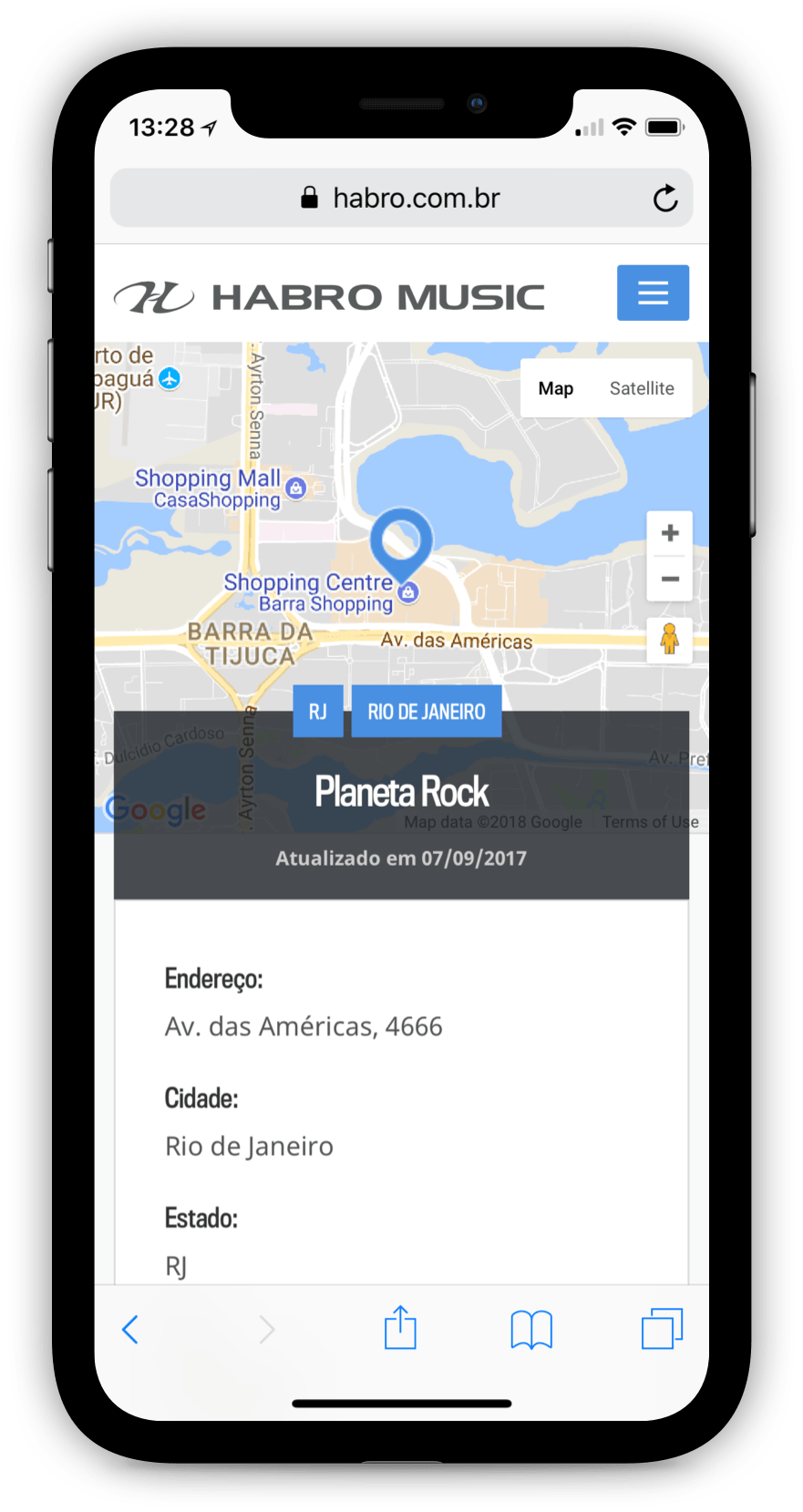
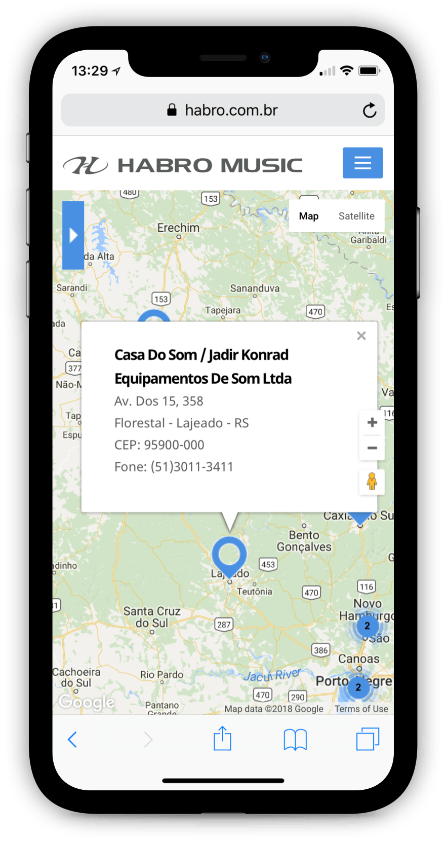
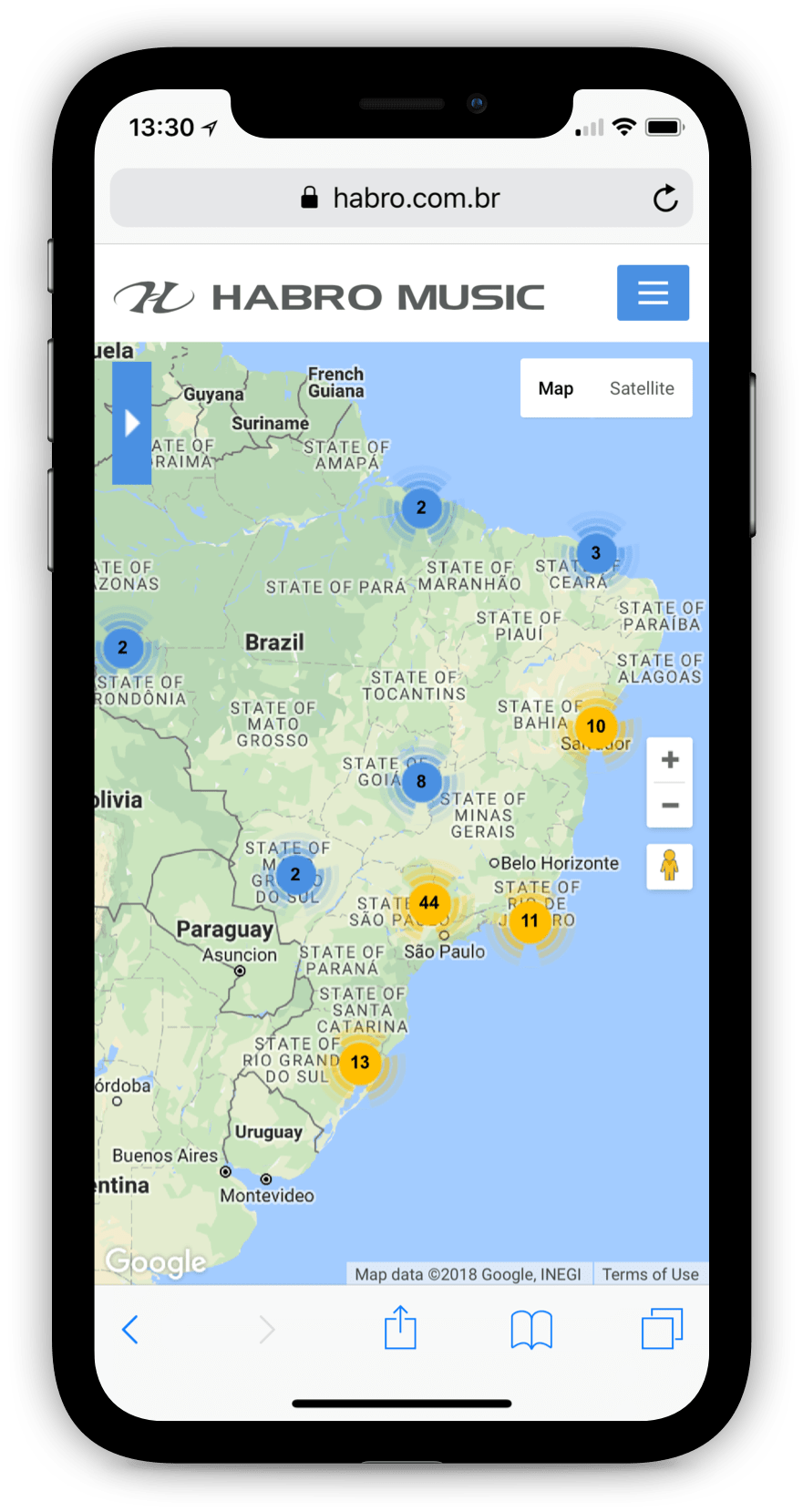
Provide an information architecture for easy management, with functional updates, using all screen resolutions, easily create new brands and the possibility to customization visual identity for each one. Find a way for a better ‘user flow’ experience to reach the goals and a store locator with available products information for sales.
Consumer Journey Map.
With this diagram, we explore the multiple (and sometimes invisible) steps taken by the consumer to the extent that they engage with the product.
It allows designers to define the motivations and consumer needs at the different stage of the journey, creating design solutions that are appropriate for each of them.
For example, buying a new instrument in the store via the dealer.
The company had most of the visits, we thought it might be interesting to integrate catalog and sales pages with user flow.
Sketching Ideas.
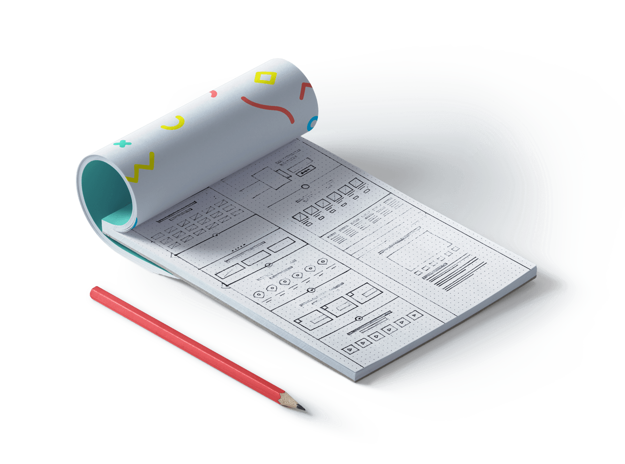
Basically, I always start with a few scribbles sketches on paper to create the initial concept of the structure. This makes it easier to engage the vision and ideas that are discussed with the client during the discovery meeting. Undoubtedly, this is an inevitable process and it is the way I find easy to get the creative process flowing.
User Interface Design Starts Now.
With a focus on improving product usage experience, centred between the company’s Sales Department and the Retailer, we came to the conclusion that a clean interface with easy access in all catalogue information, the two major departments would gain time and agility to share information.
It was also important to pay attention to every visual identity of each brand, to inform the user where they are on the website.
High-Fidelity Wireframes
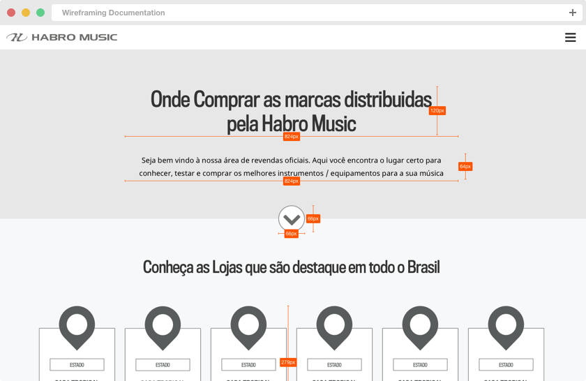
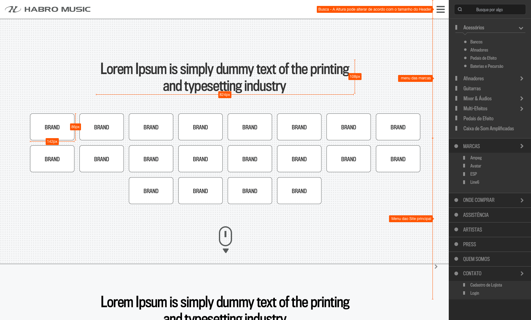
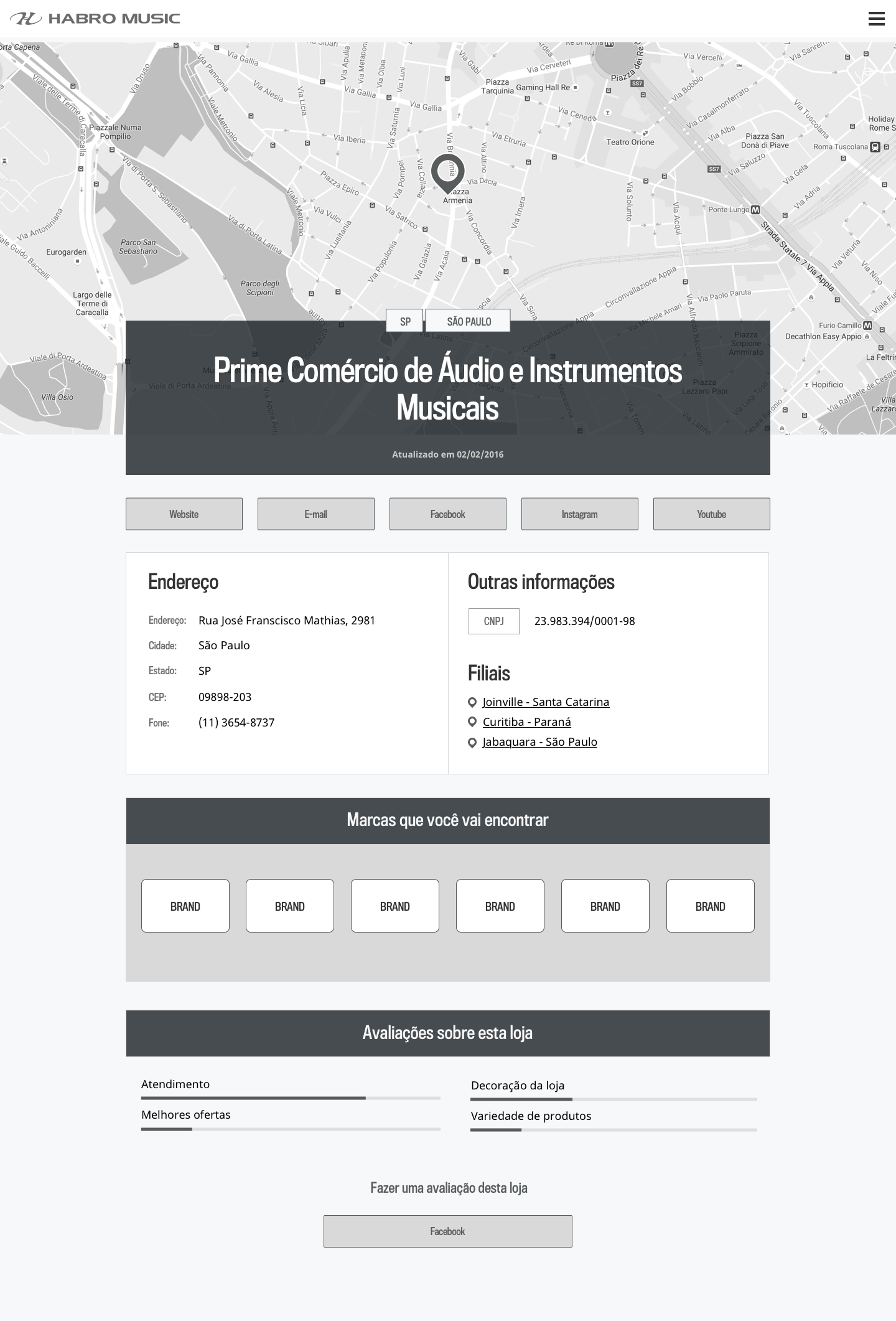
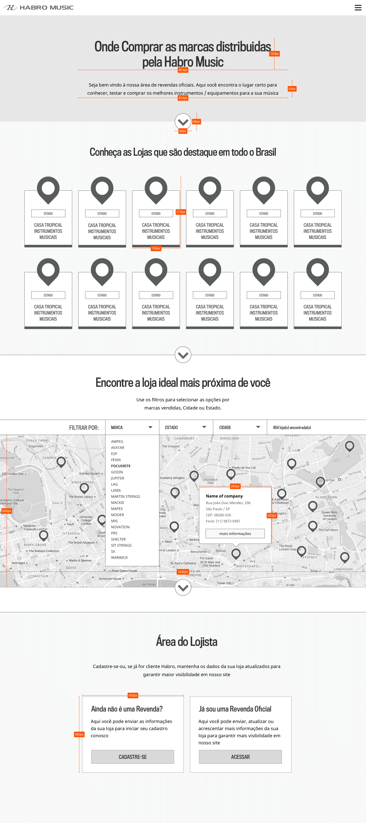
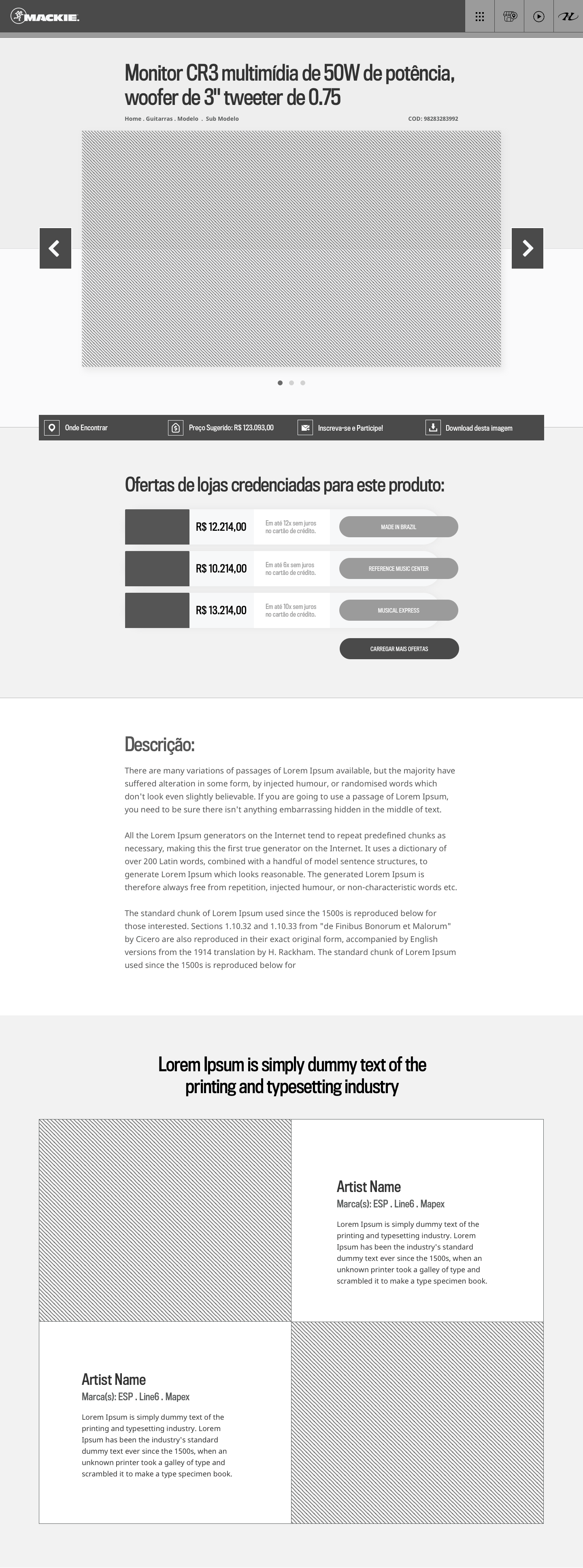
After the brainstorming and sketching phase, I start creating wireframes. Most of the time they are navigable. – It’s the best way to understand the product and to visualise how it will work for.

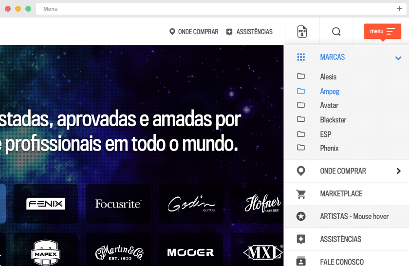
Menu
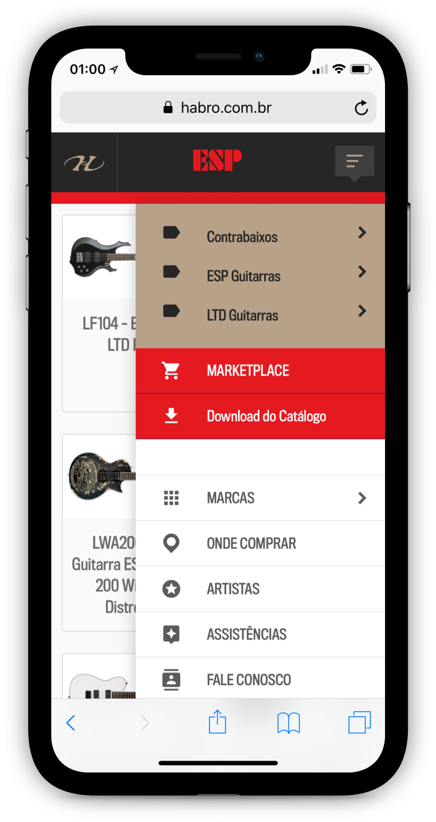
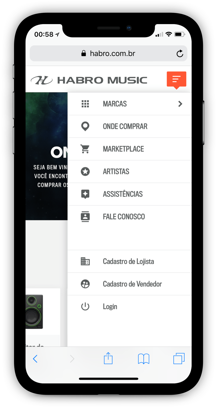
We decided to use a side menu in all devices. Because of the many categories and subcategories, this was the ideal solution for this product.
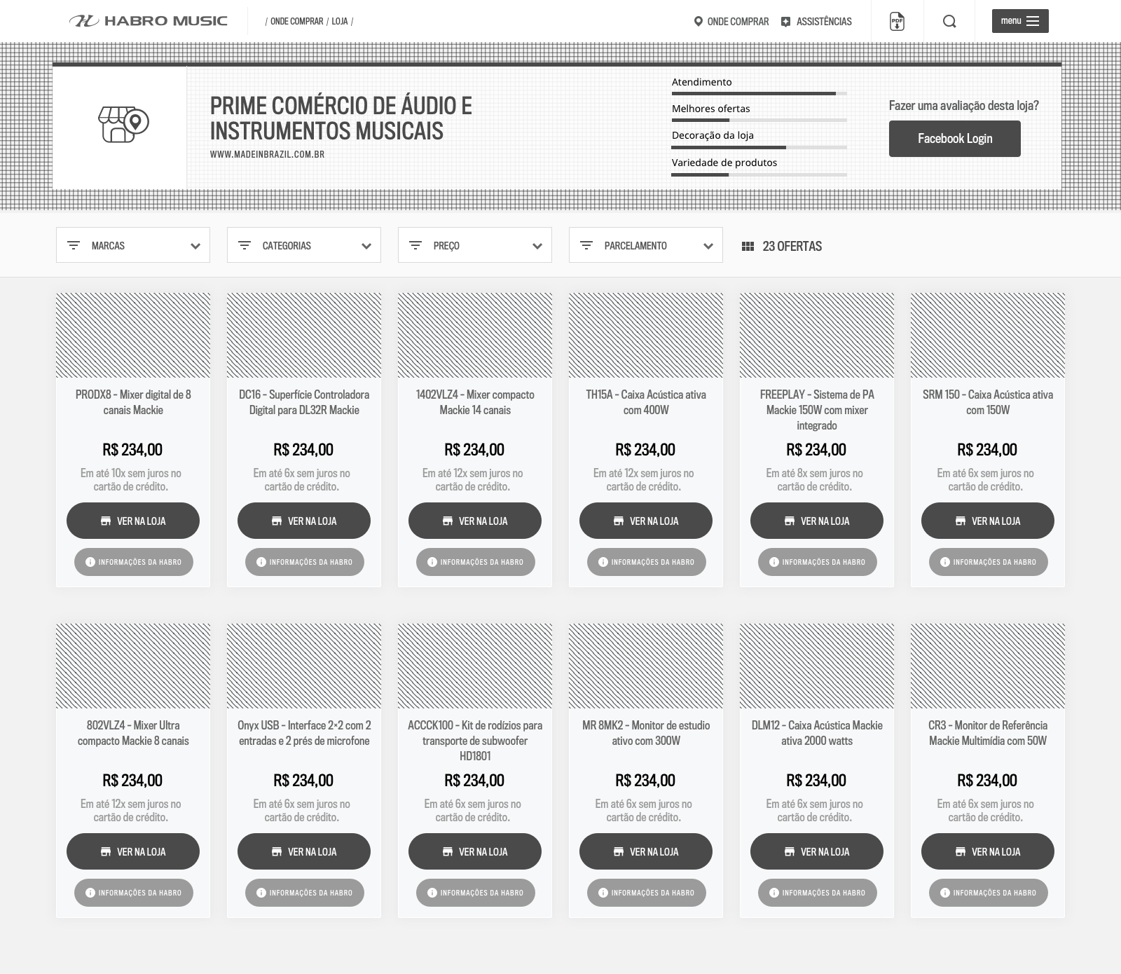
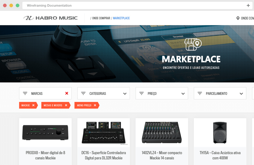
Catalogue Filters
The filters were an important factor in the catalogue, thinking about the day-by-day of who would use it.
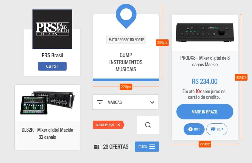
UI Components
A complete library to maintain consistency and standardize use across multiple screens and professionals
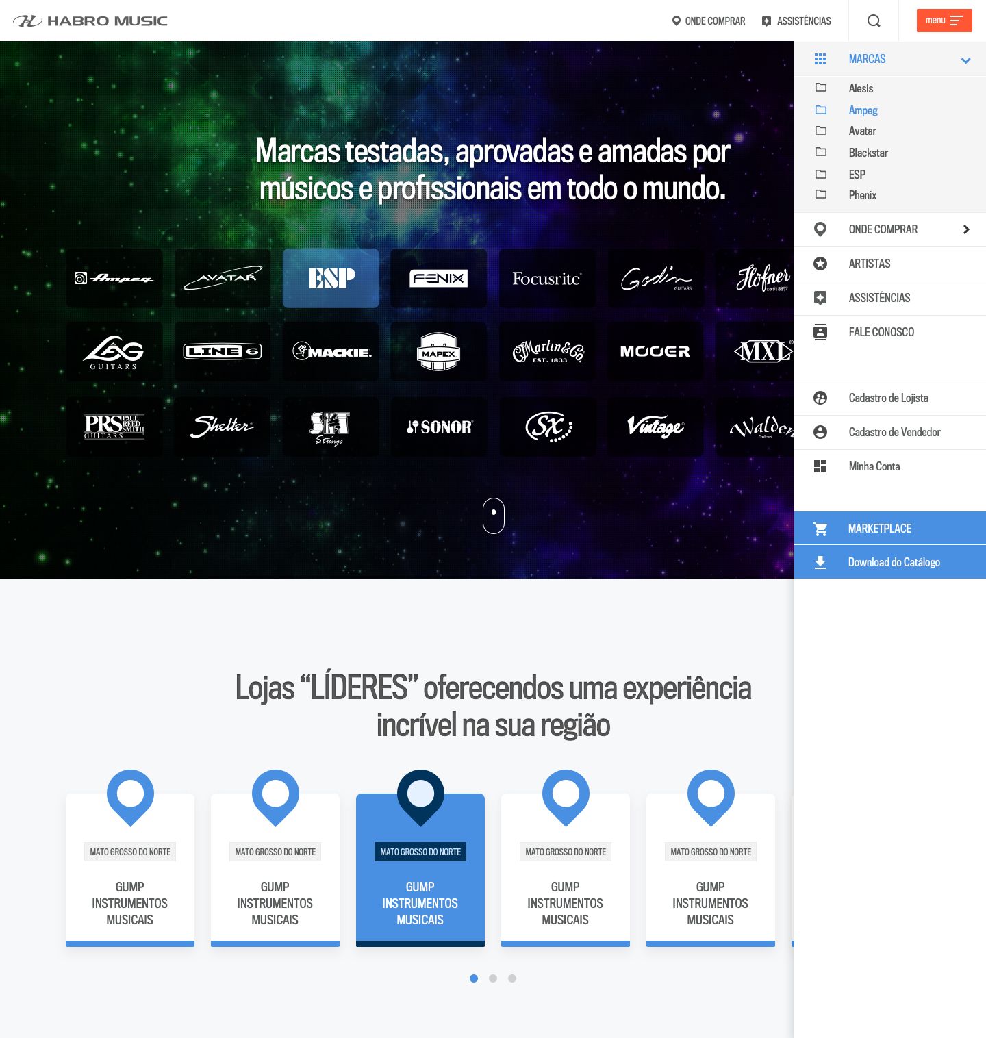
Desktop
Final Deliverables
Here you can see the final result of all the deliverables described above.

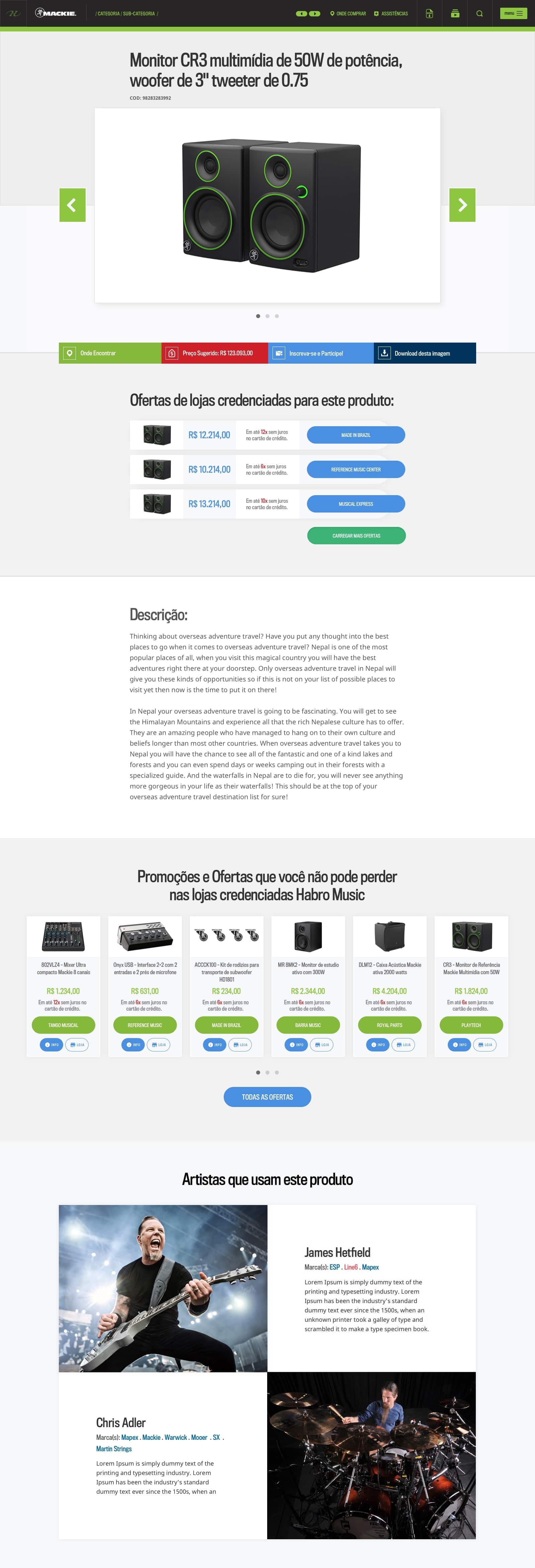
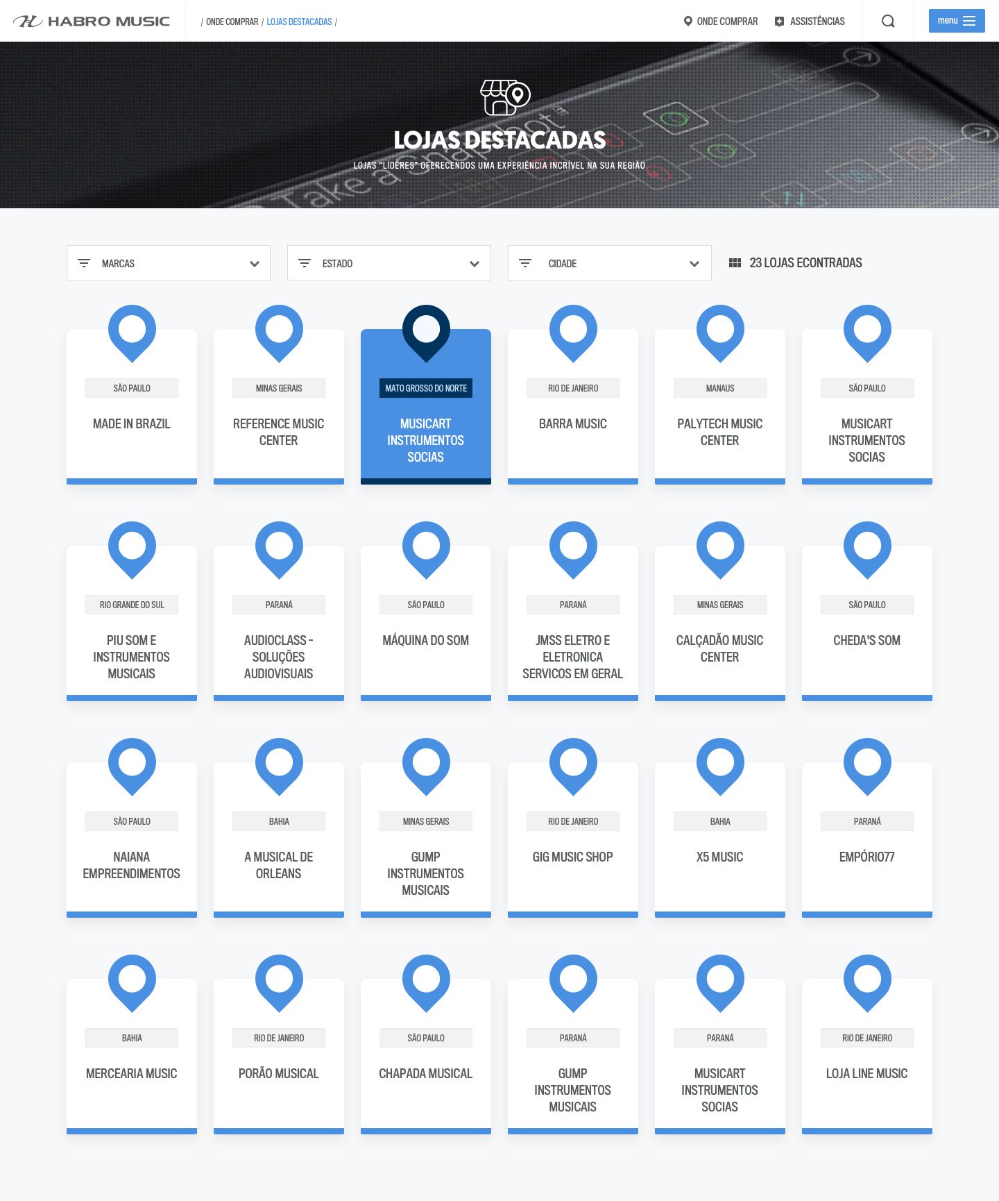
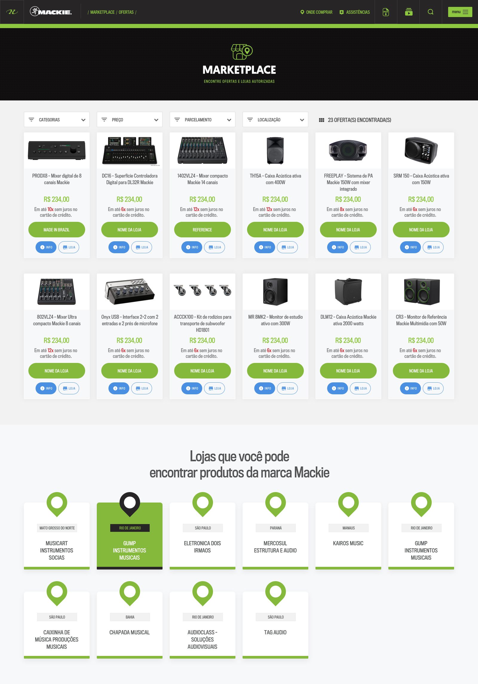
Responsive Design Final Deliverables
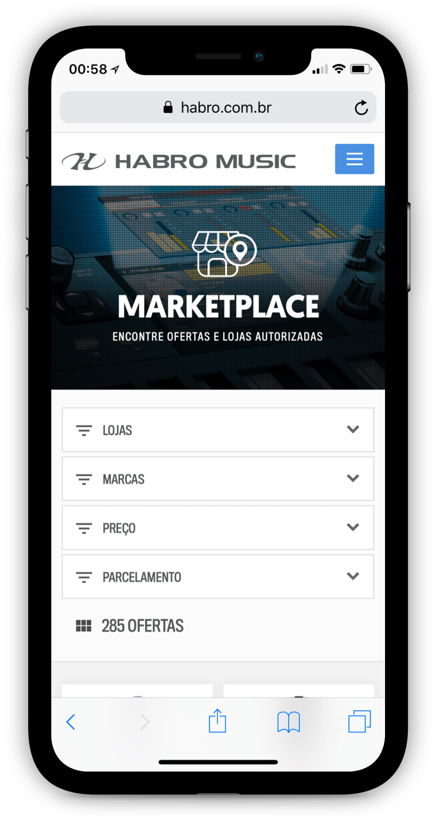
Responsive web design (RWD) is an approach to web design aimed at allowing desktop webpages to be viewed in response to the size of the screen or web browser one is viewing with.
In addition, it’s important to understand that Responsive Web Design tasks include offering the same support to a variety of devices for a single website.
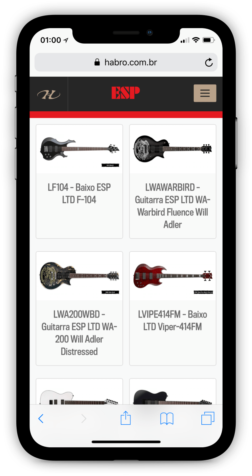
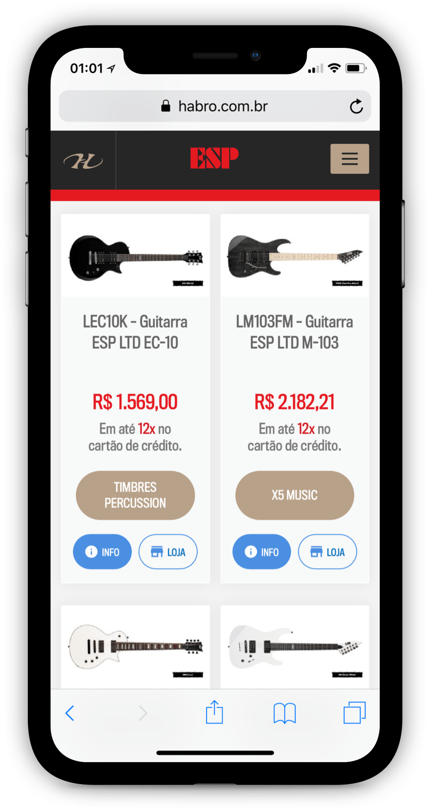
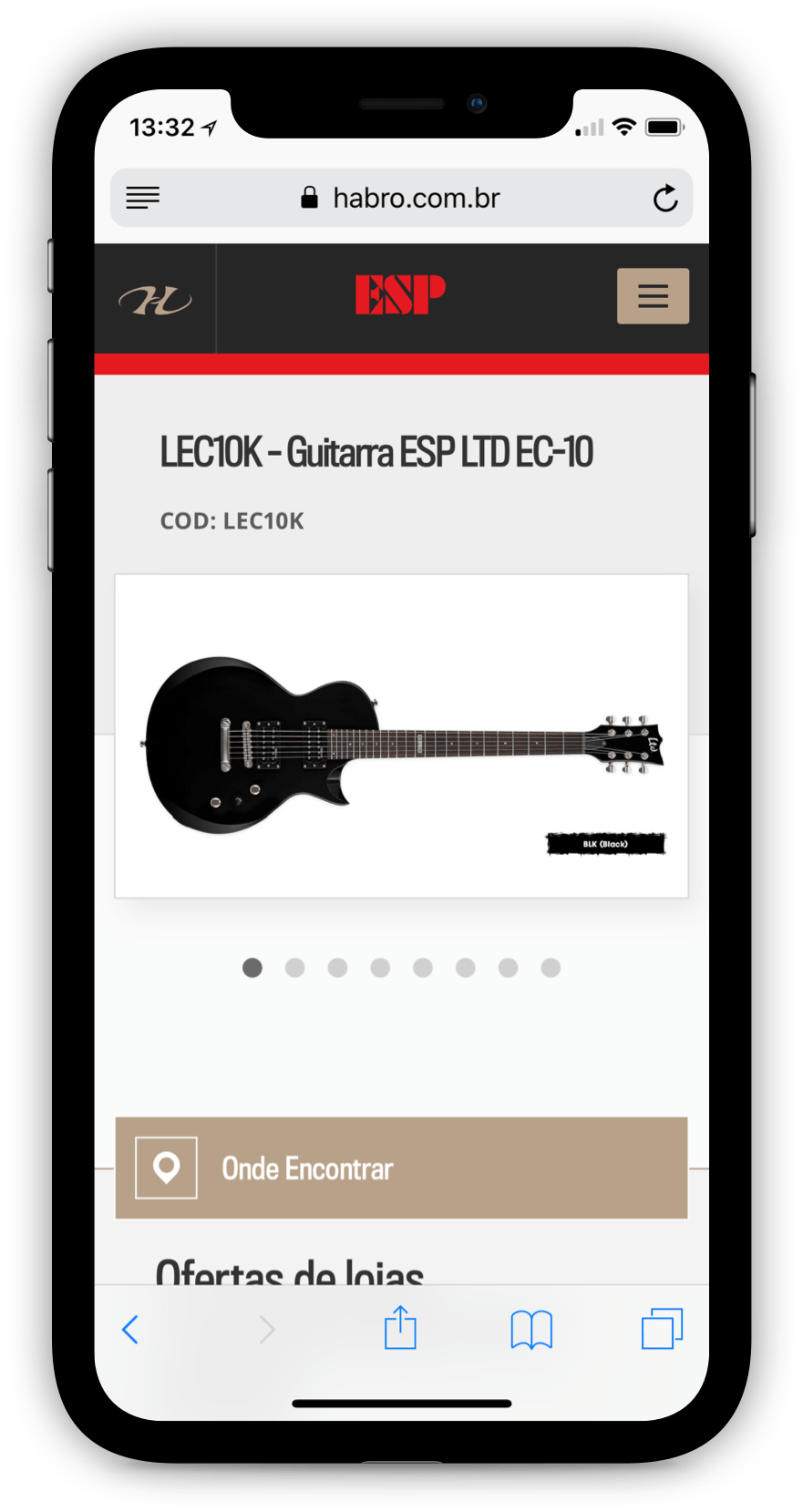
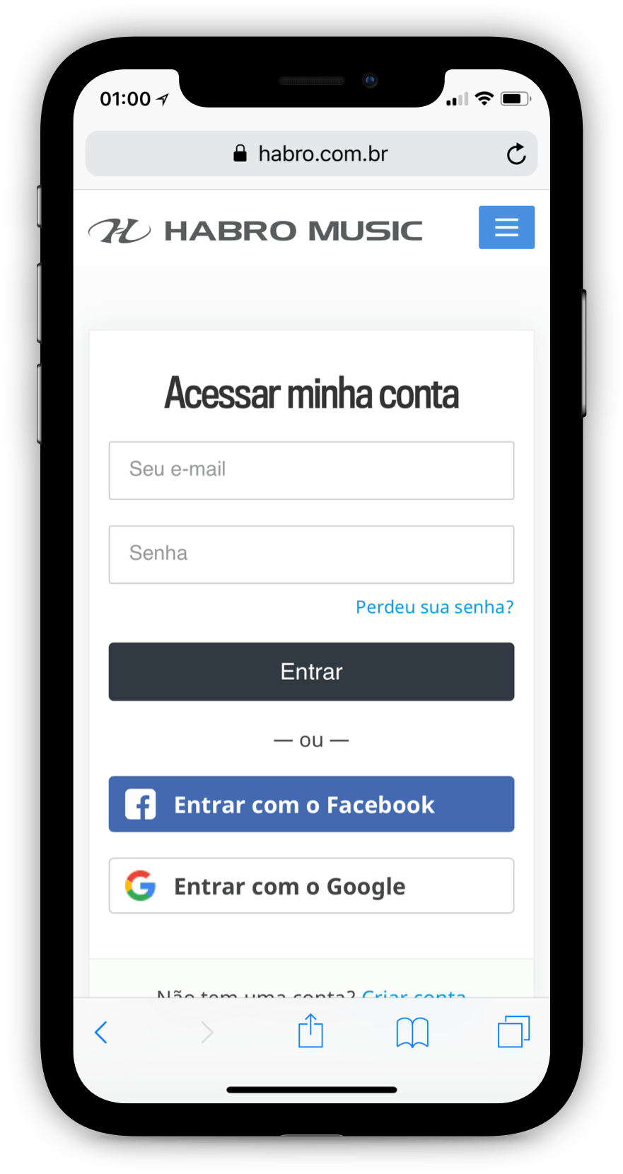
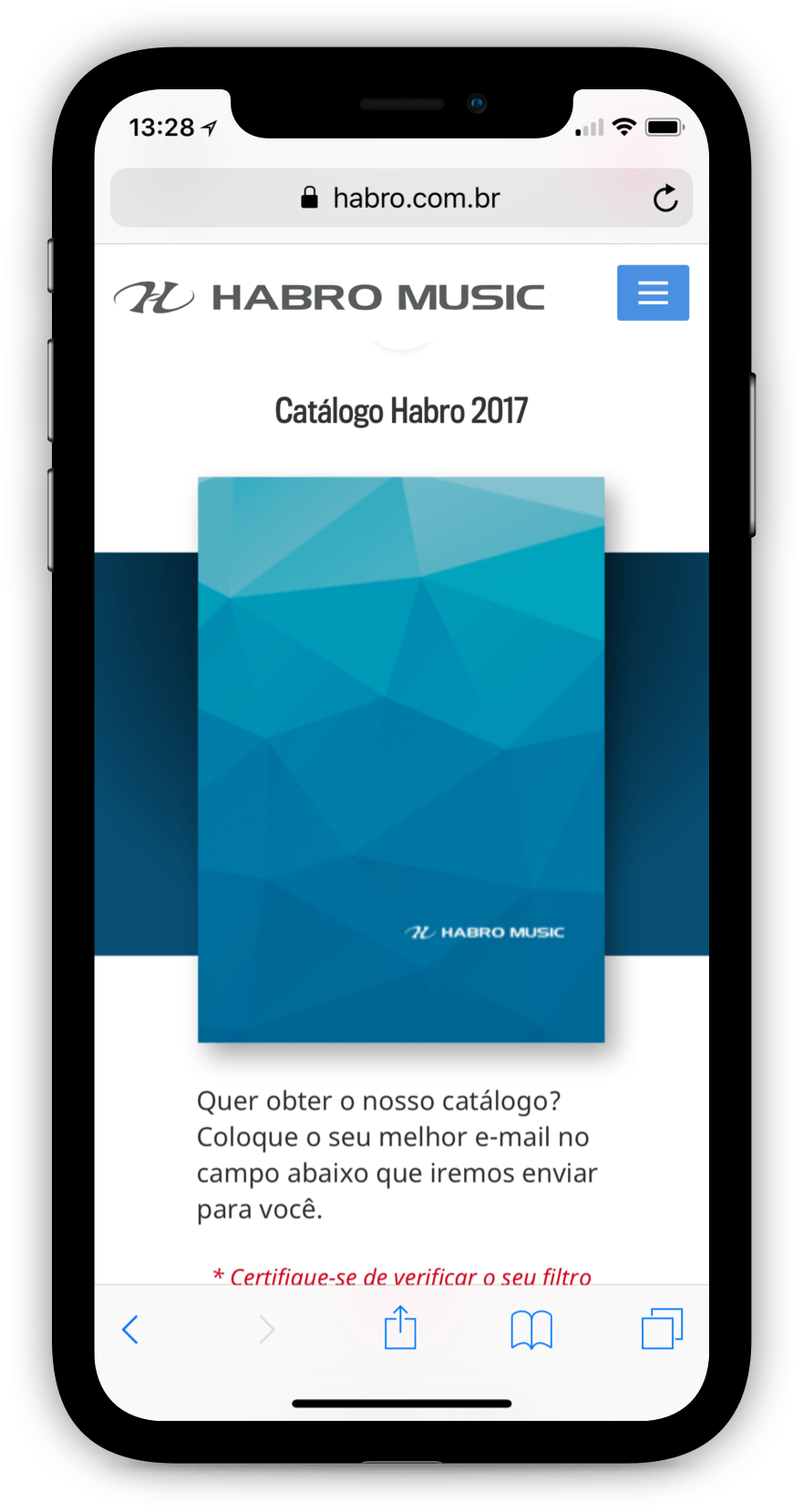
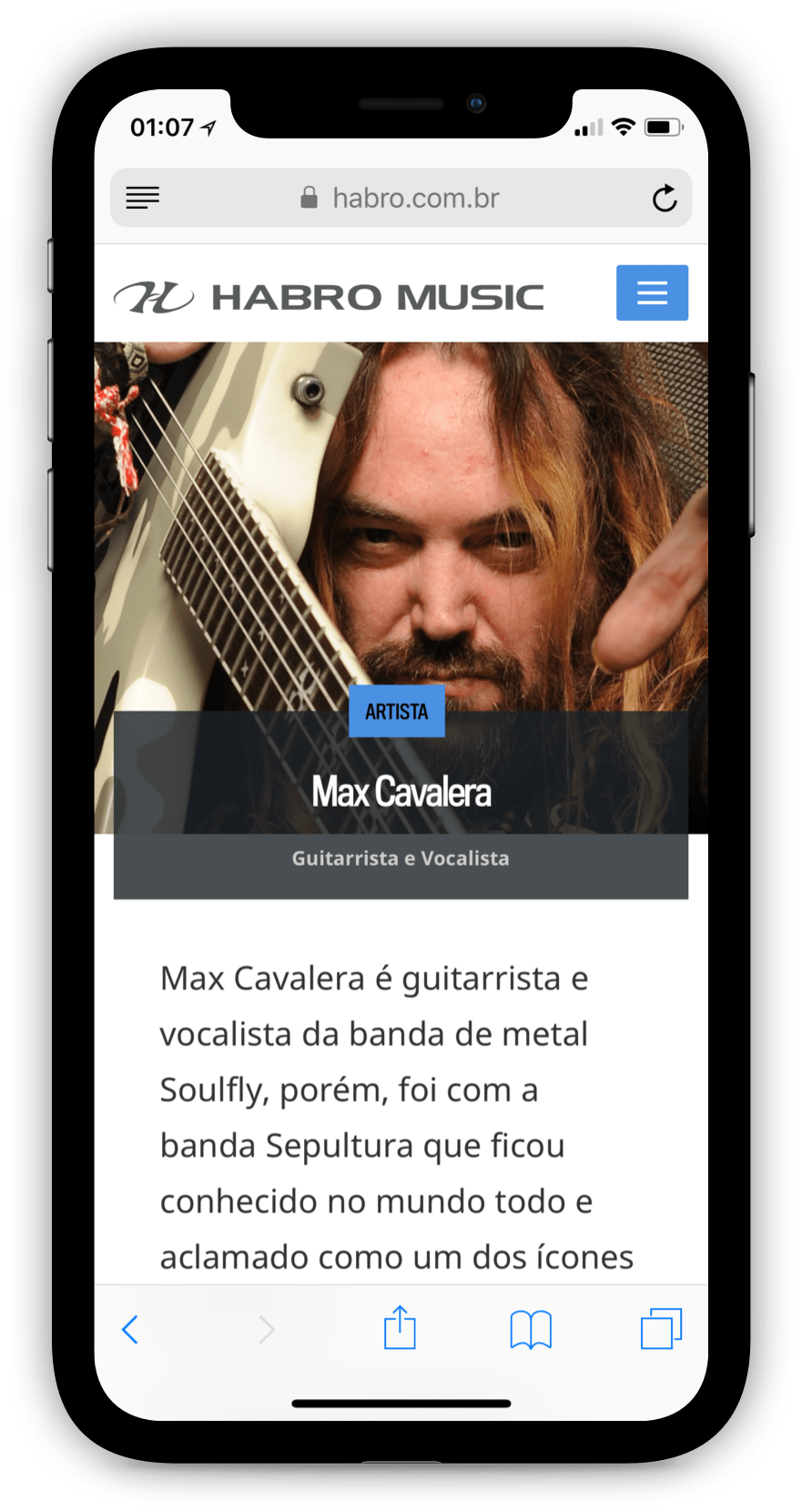
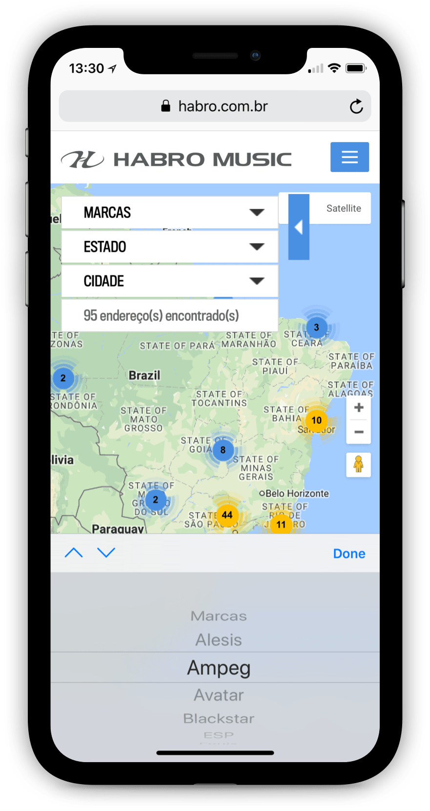
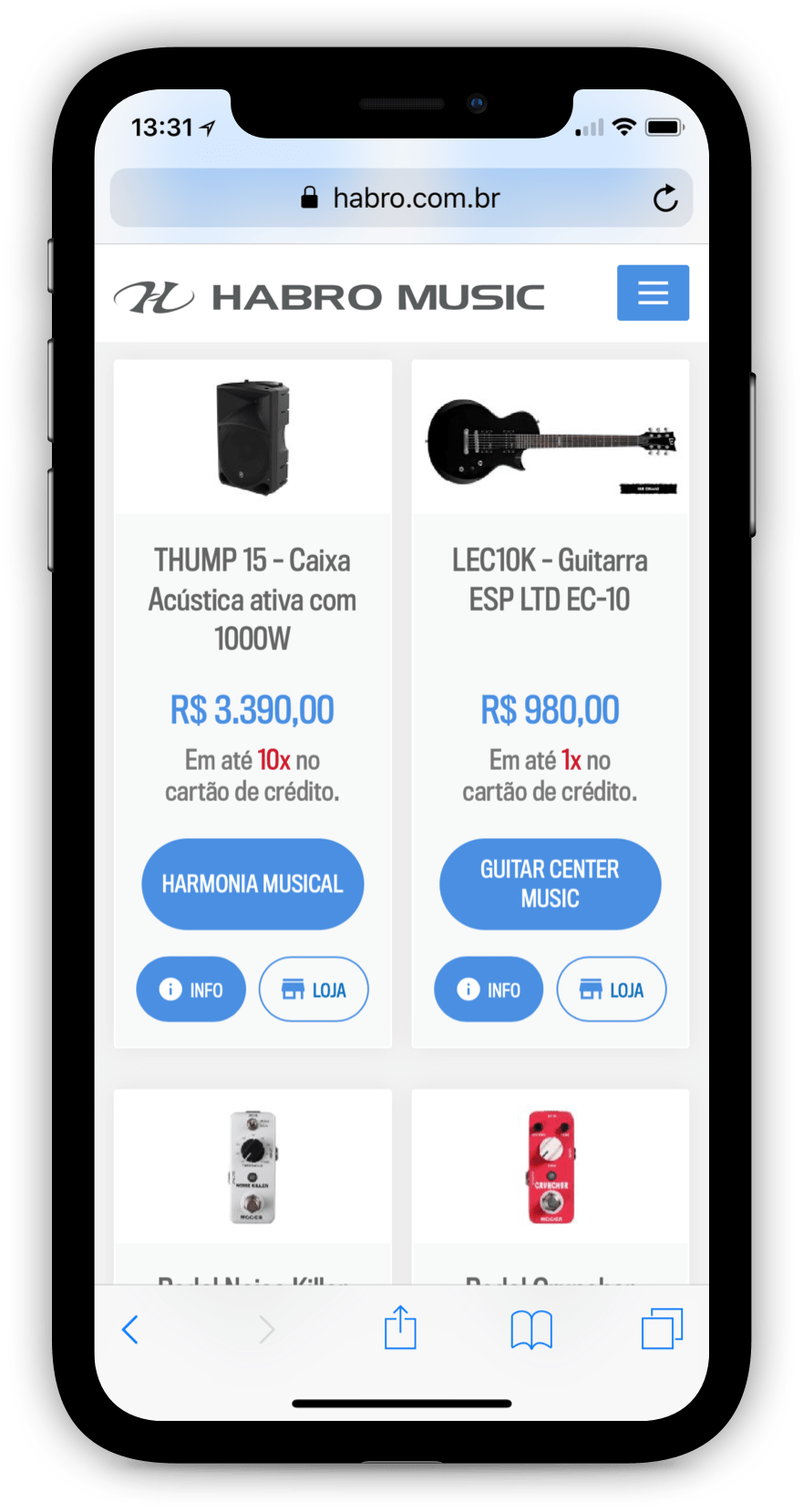
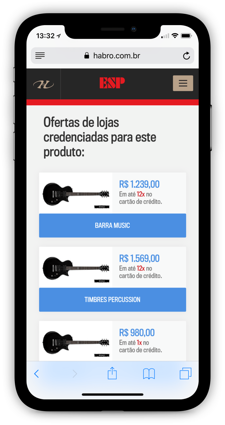
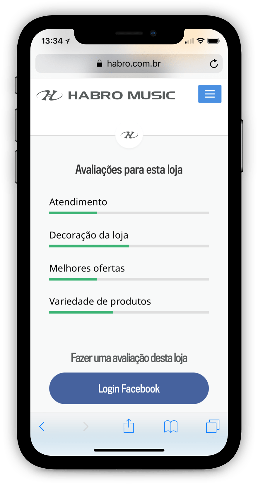
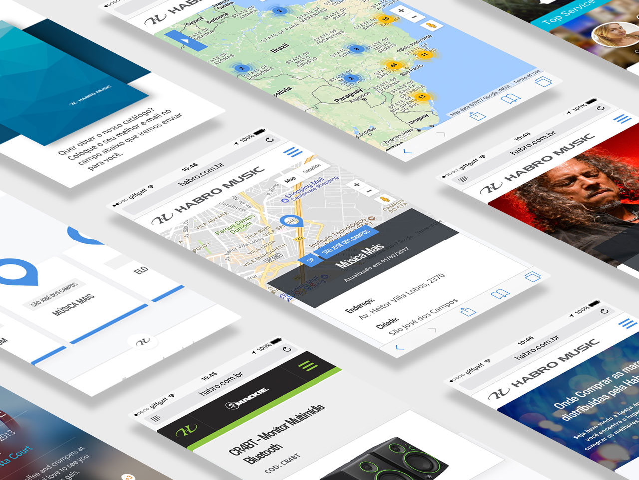
See below for all deliverables for the mobile version
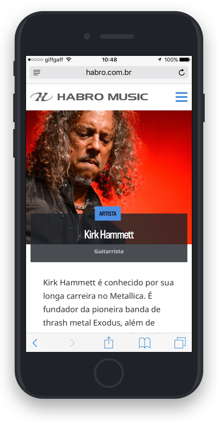
Strategic planning and results
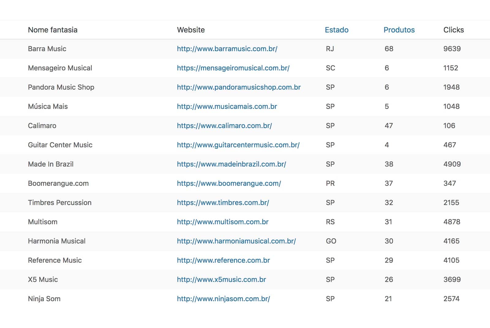
The pride of having participated in a promising project. Statistics show what we are learning, what our mistakes and correctness, what the user wants, what works and what has had to be improved. In the image some data of validation and learning.

