Royal Music Latin America
In 2015, distributors of music equipment in Brazil has been transformed. – Introducing the Royal Music Latin America, a new product catalog. This is the story of how I made a positive difference to a company of a segmented market.
The Customer
Founded in 1994 and with representatives in all states of the country, ROYAL MUSIC presents itself in the musical instruments market as a leading importer, a pioneer in promoting access to musicians and audio professionals, with the best equipment in the world.
Royal Music has over 20 brands that are highly sought after by musicians and competitors. It’s a hard work gathering under one roof names like Gibson, Paiste, Zoom, Music Man, Orange, Ernie Ball. Leading musician and instrument manufacturers find Brazil’s high tax burden difficult as they are competing with a multitude of products with similar design and lower quality. Read more
Testimonials
Paulo Faysano – Marketing Manager at Royal Music
improvements ★★★★★
Marcelo has always been present and punctual in everything we asked for. He recently updated our website, adapting it to a mobile format and other screen formats. Marcelo is a great partner due to his speed, great layout suggestions, understanding of the market trend and excellent value. I would recommend Marcelo to any company that wants a quality website.
My Role
I was part of the field team and was responsible for the strategy, experience and design of a new website. I led the UX work, producing all major deliveries and presenting it to the customer, between May and July 2015. I worked beside a Senior Developer & Senior IA, to make the set.
The challenge
Build a website in 45 days 🙂
Our client approached us with two main objectives – to increase the functionality of its catalogue of online products and usability in addition to its competitors; to promote an active life in the music community in Brazil – Customer x stores. Our major challenge was the short website deadline of just 45 days.
We work with two main objectives:
- Increase the functionality of the online product catalogue promoting clear access from both mobile and tablet.
- Promote greater usability to set us apart from our competitors, encouraging the active life in the music community in Brazil and strengthening the ties between client x stores.
To coincide with a possible expansion of the scheme, our team was under extreme pressure to move quickly. We were tasked with delivering a responsive website prototype HiFi for different kind of devices and the most important, connect retailers x business x users. This will be the perfect combination to entertain users to buy products through our customers. Drafts and usability testing meant that I needed to get the experience right in the first four weeks.
The prototype of the responsive website with high fidelity in different types of devices that connect retailers x company x users to provide the best experience to users of the site with the perfect combination of entertaining users and assist them in choosing the purchase of products they aimed. This design was made within a short timeframe but every step was well planned with drafts and usability testing that ensured direct experience in the first four weeks of the project.
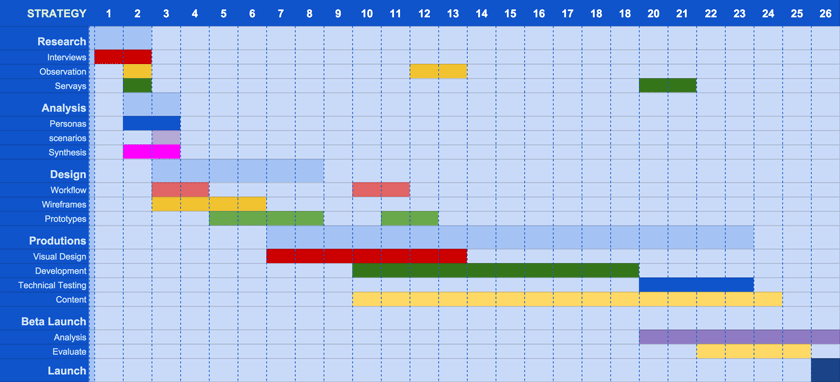
I created a schedule on google docs with all the steps to share with other team employees:
Starting with the Interfaces Design
I’ll introduce all the main deliverables of the process of User Interface Design that I’ve done for this company. If you feel interested to know more, there at the final bottom of this page has a link for you to read all the UX process.
What I Did
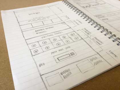
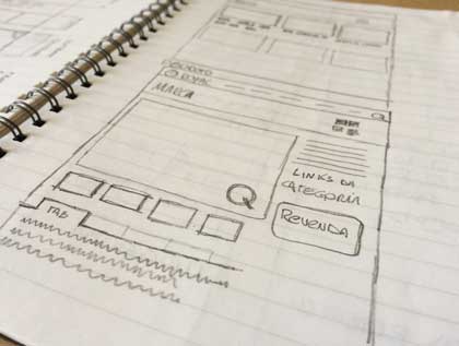
Sketches
I scribbled a new interface using pen and paper. Sketches can be very useful to quickly validate product concepts and design ideas with other team members and users.
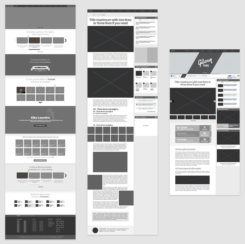
Wireframes
The part I most enjoy is to do a visual guide that represents the page structure as well as its hierarchy and the main elements that compose it. This is useful for discussing ideas with the team and with the customer, and to inform the work of the Art Directors too (in this case, I did the work myself).
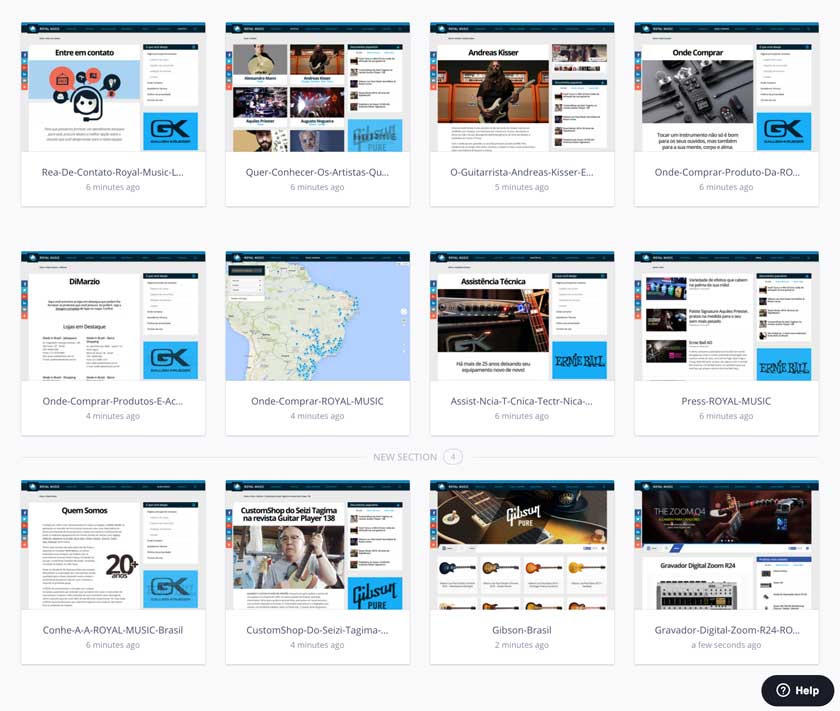
Prototypes
The Invision, as always, does its homework. Lately I’ve been working more with prototypes which have greatly made life easier. A prototype is a simulation of navigation and functionality of a site, normally composed by clickable wireframes and layouts. It’s a quick way to validate and test a product before you develop it from start to finish.
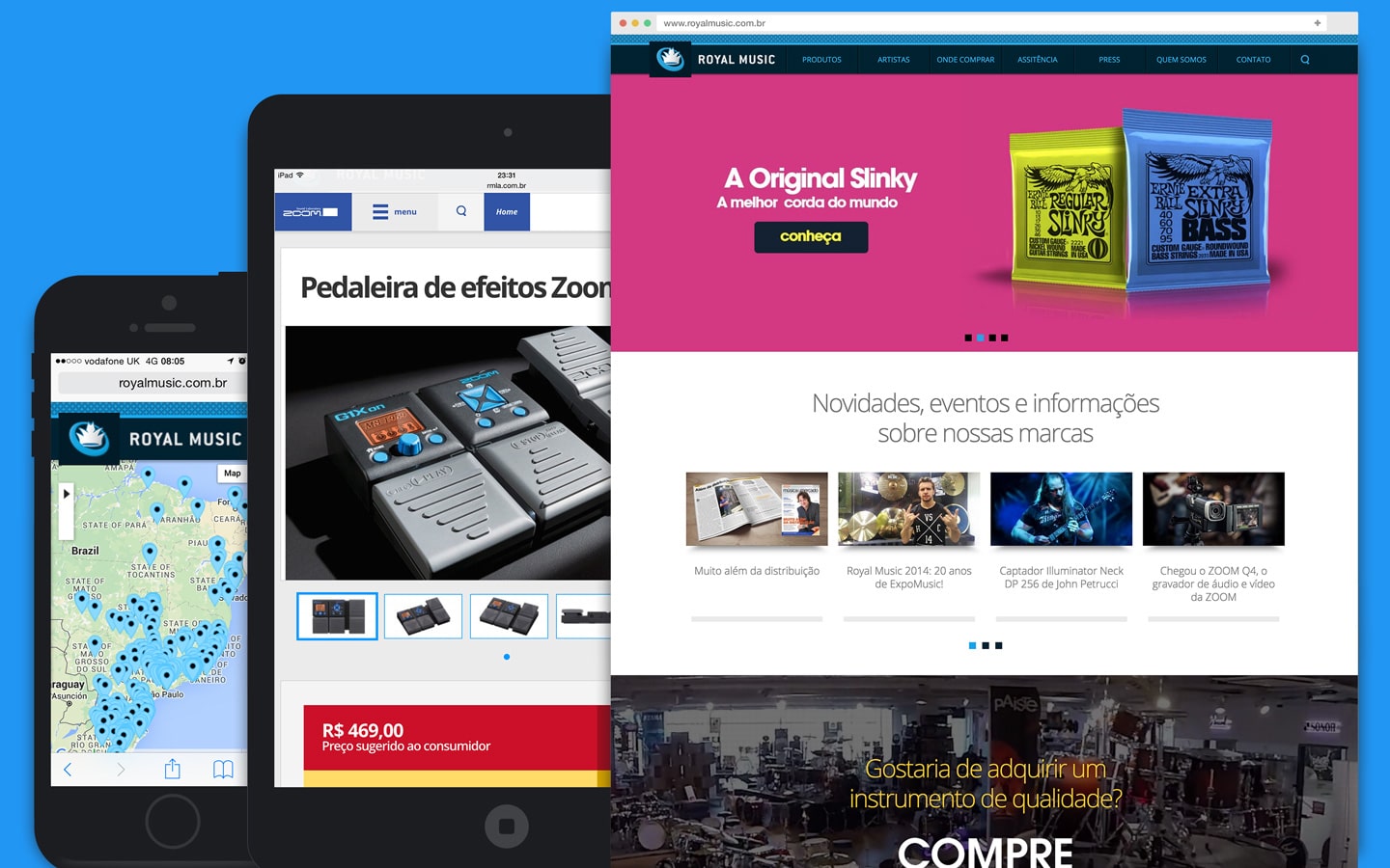
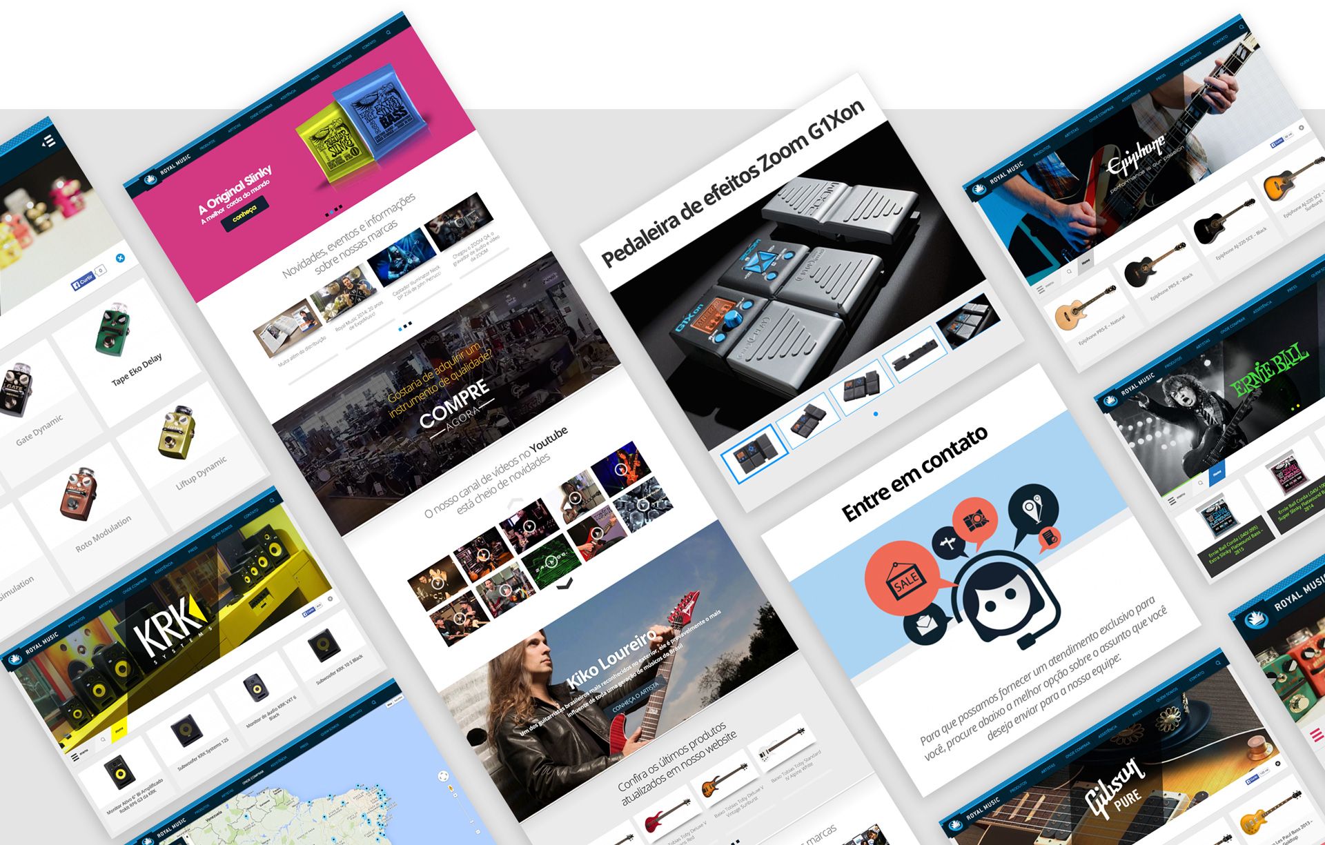
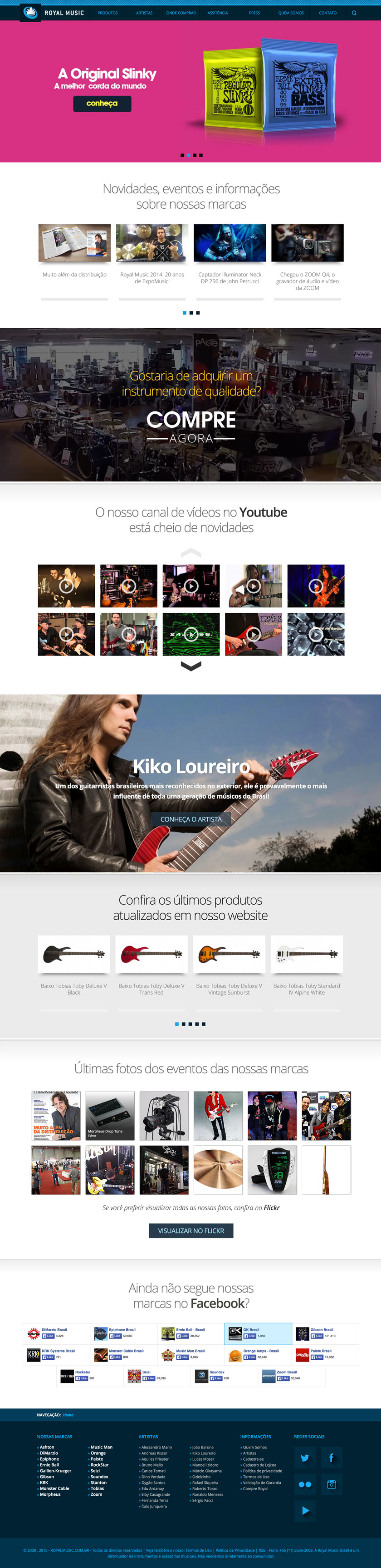
Desktop Interfaces
Here I’ll show you what were the main deliverables in all versions of devices such as: Desktop, Tablet and Mobile. They are a true representation of all project.
Final deliverables
We wanted all within the same standard layout grids, wanted the main website and the websites of the brands within the same structure and can align everything in a practical way for when the user was browsing in any one of the brands they know what was on the same website , different from what we did in the past creating a website for each different brand.
Usability in navigation
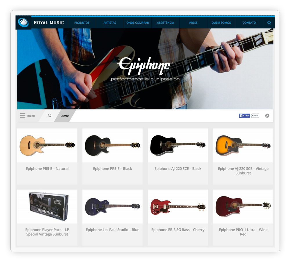
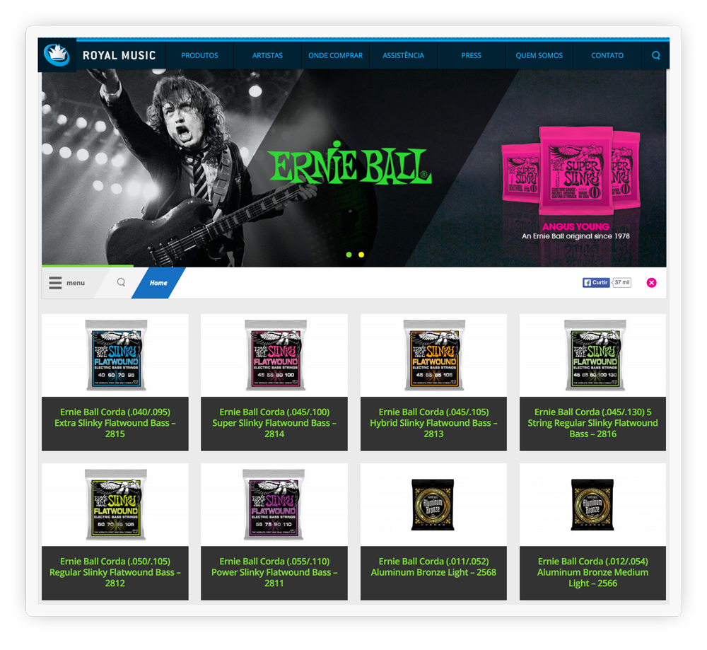
Two important factors were high regard navigation brands. We had 15 different brands the need to provide easy access to the user and the merchant. We decided to put all brands in a single drop-down menu and with just one click, the user can access fast way the required Brand.
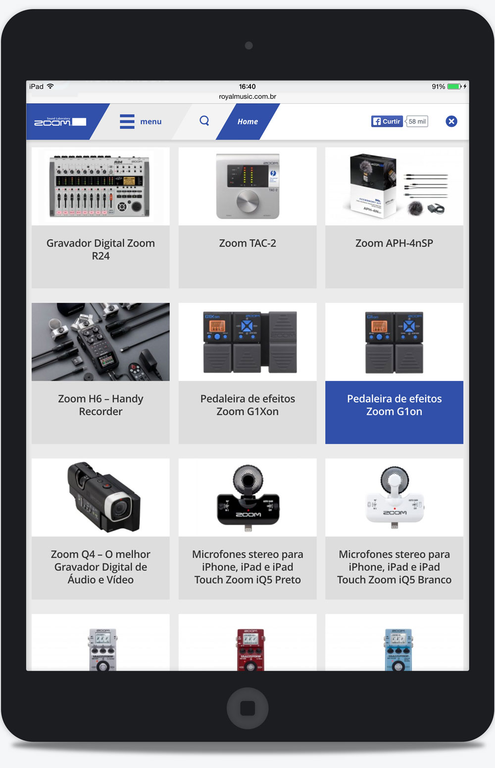
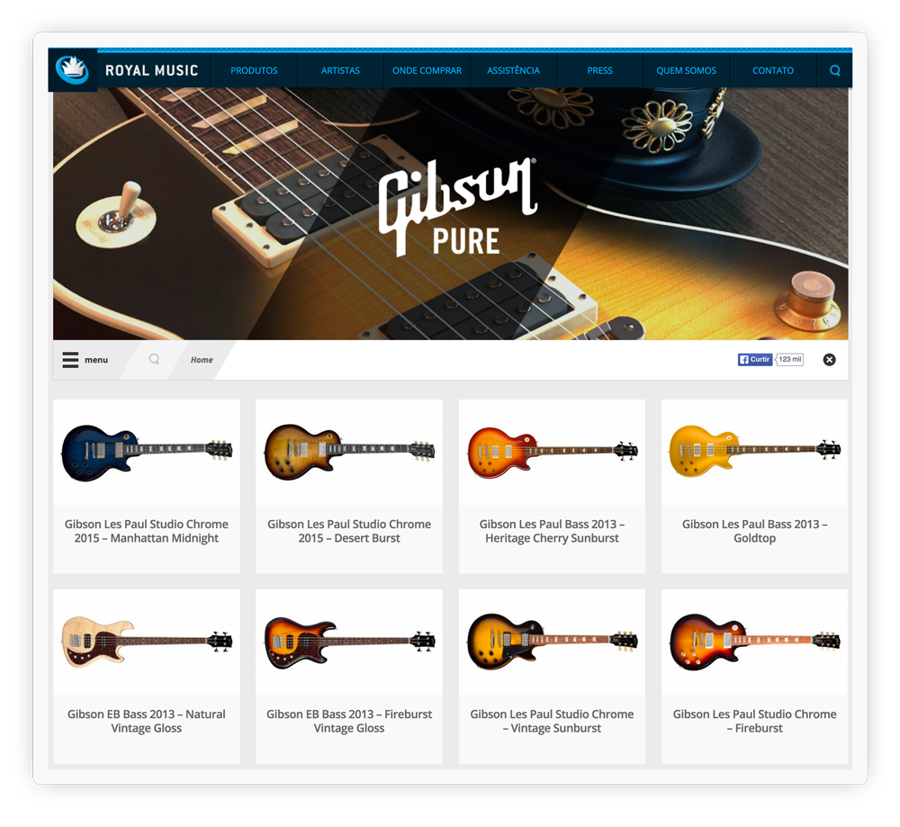
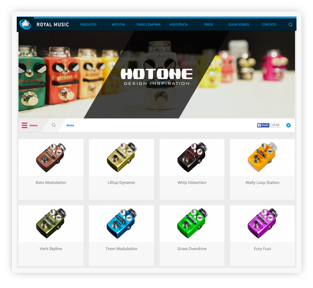
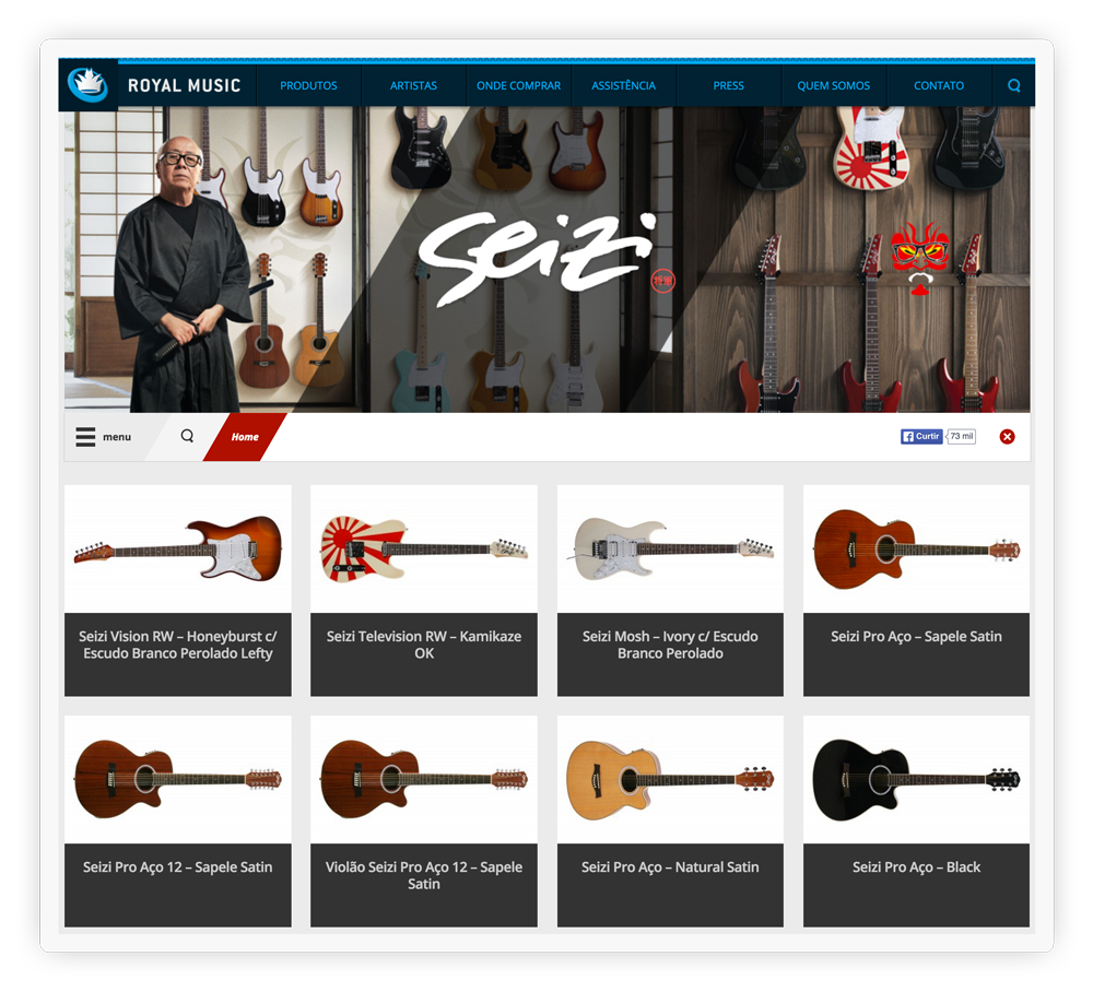
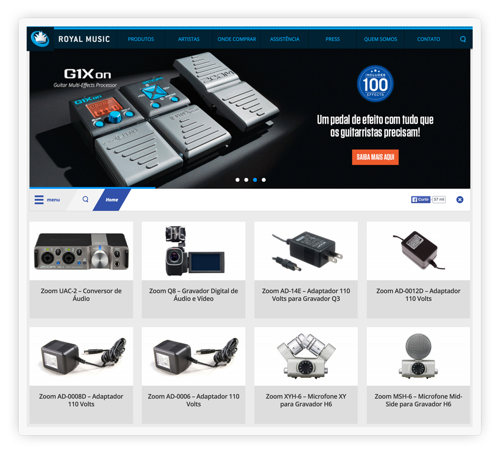
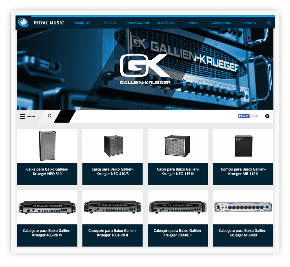
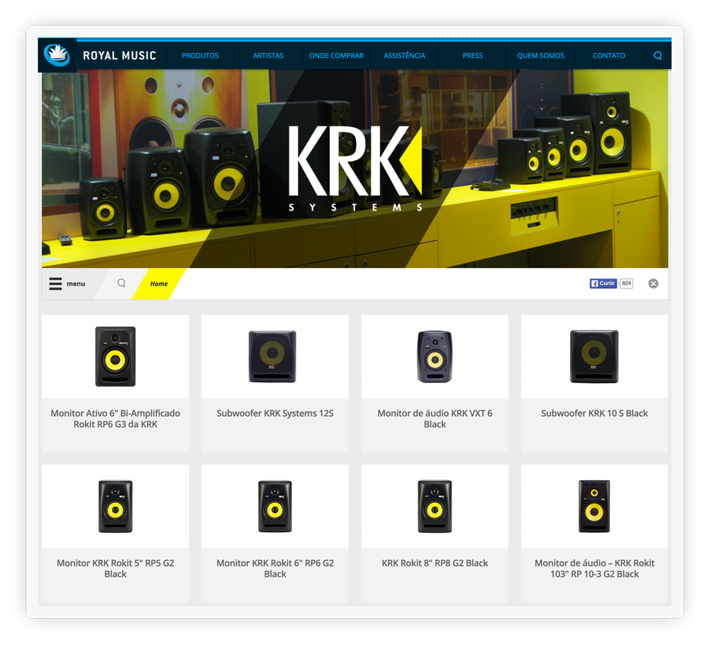
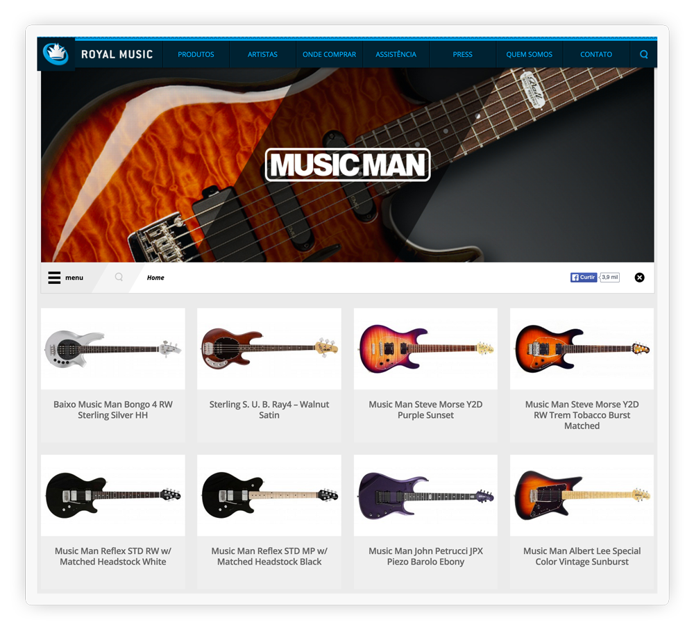
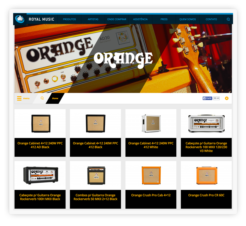
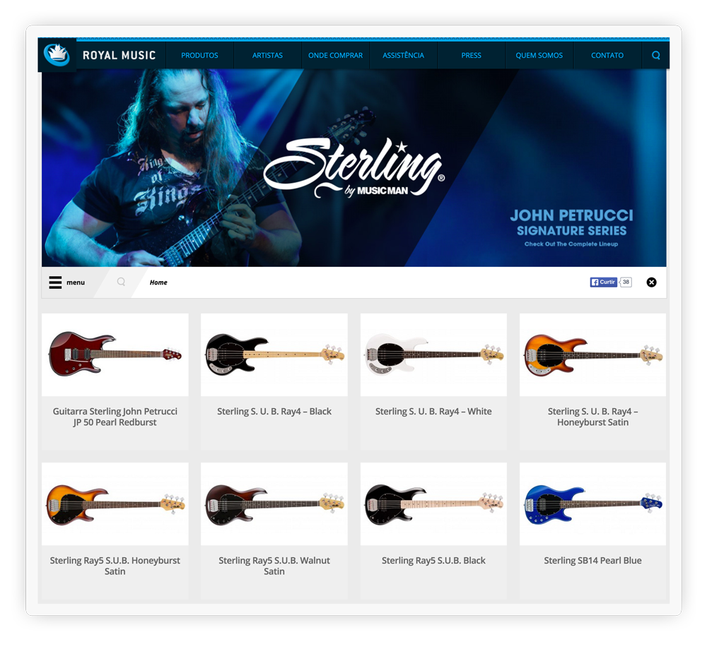
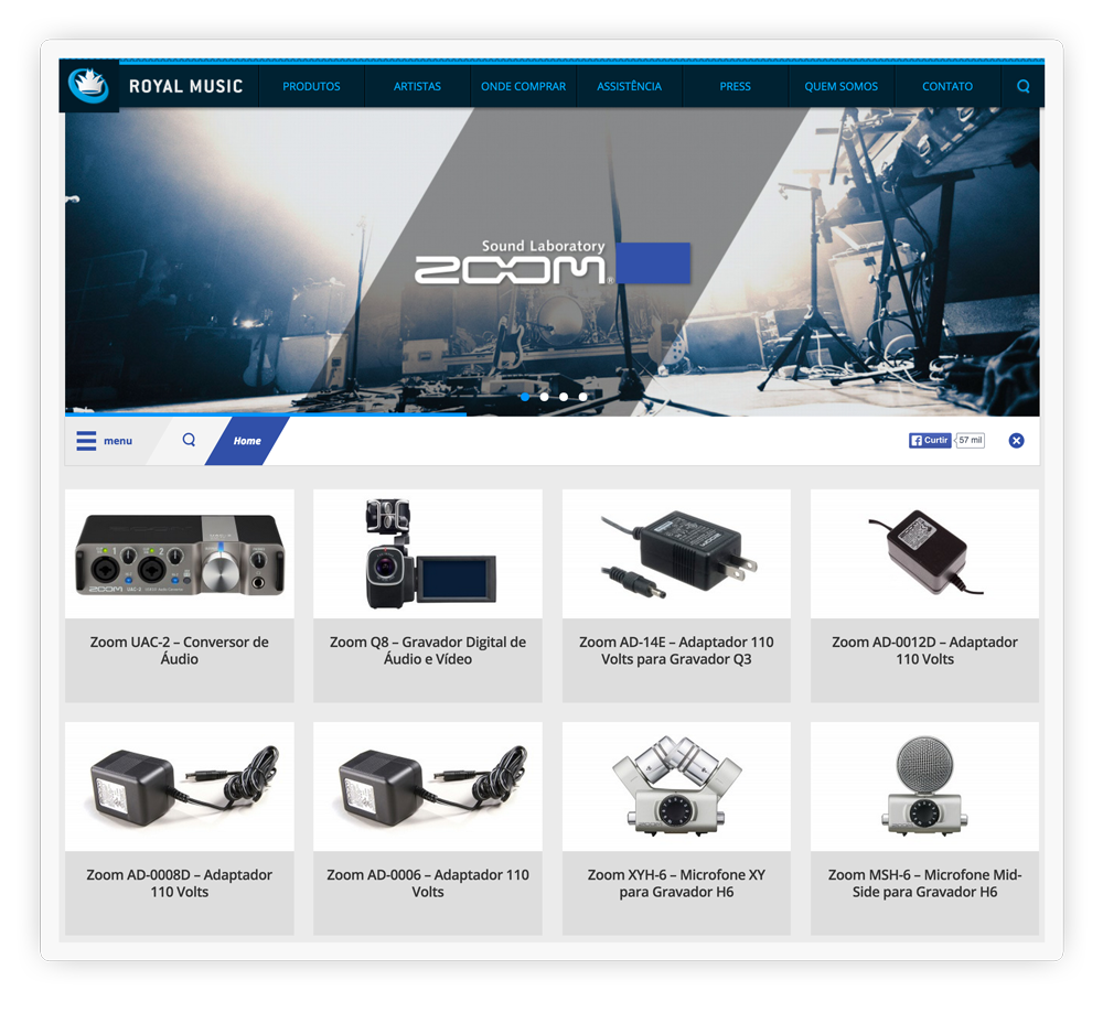
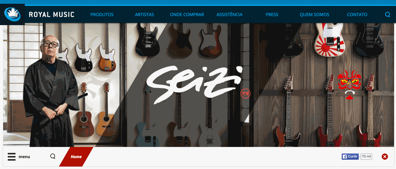
Brands Identity
We care to provide the colours and images related to the visual identity of each brand. Here you can see some screens focused on the same structure and with different colours
Usability on the scroll
To create a comfortable navigation, we use Parallax effects on almost every website. To make the usability of the website even better, we play with the scroll of the website. When the user uses the scroll bar, it does not lose the brand and the website menu.
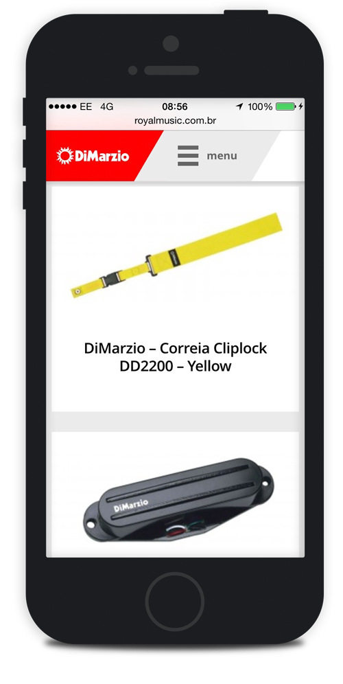
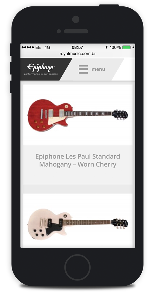
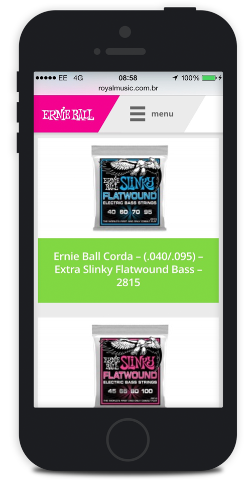
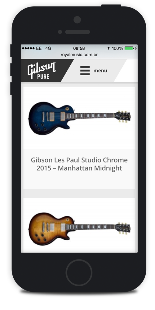
Mobile Version
As all good and actual project, web site without version for mobile, tablet can not. Every time we plan to be a responsive website and work properly on any screen size. The task was not easy as we needed to provide a visual identity for each brand.
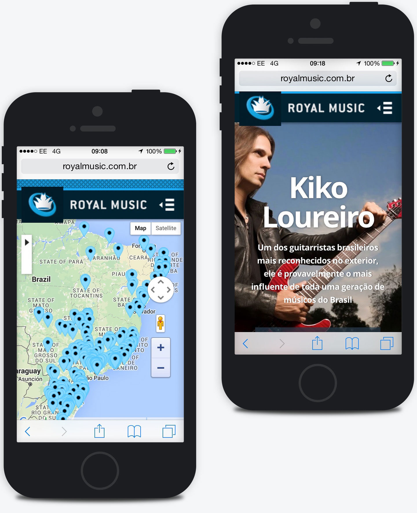
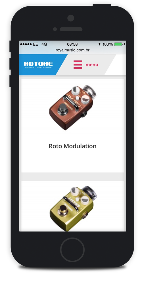
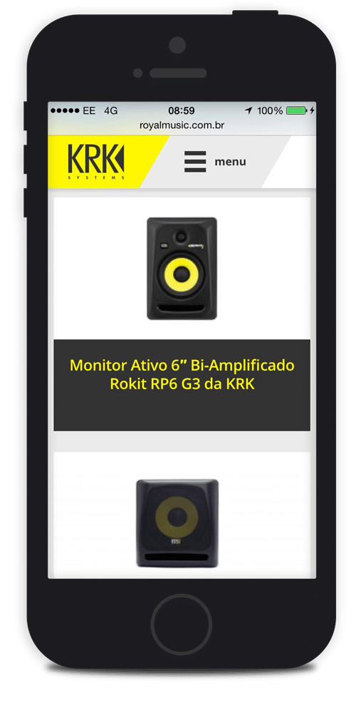
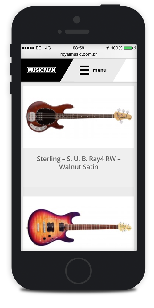
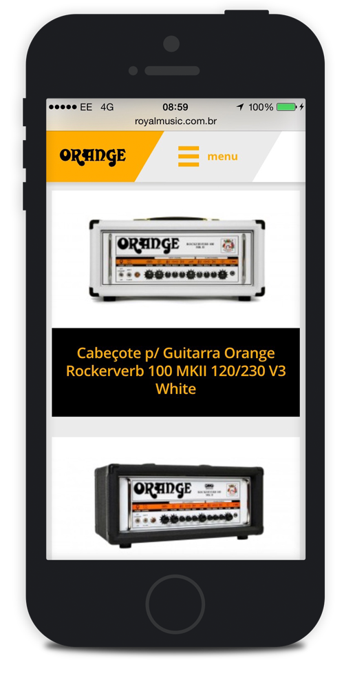
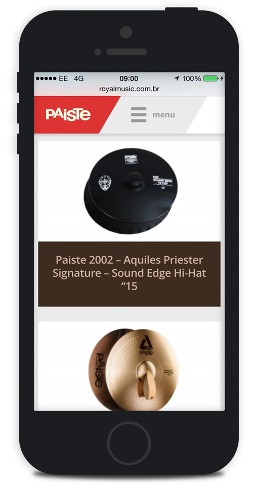
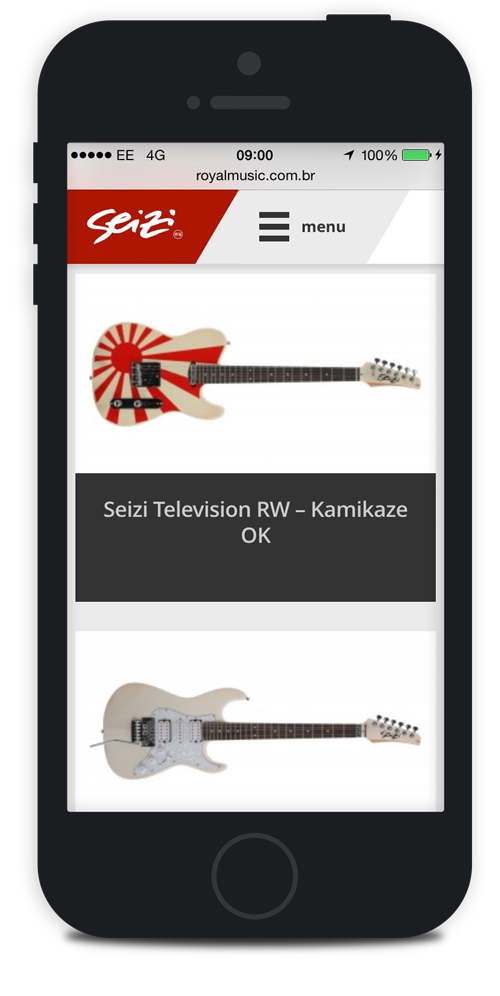
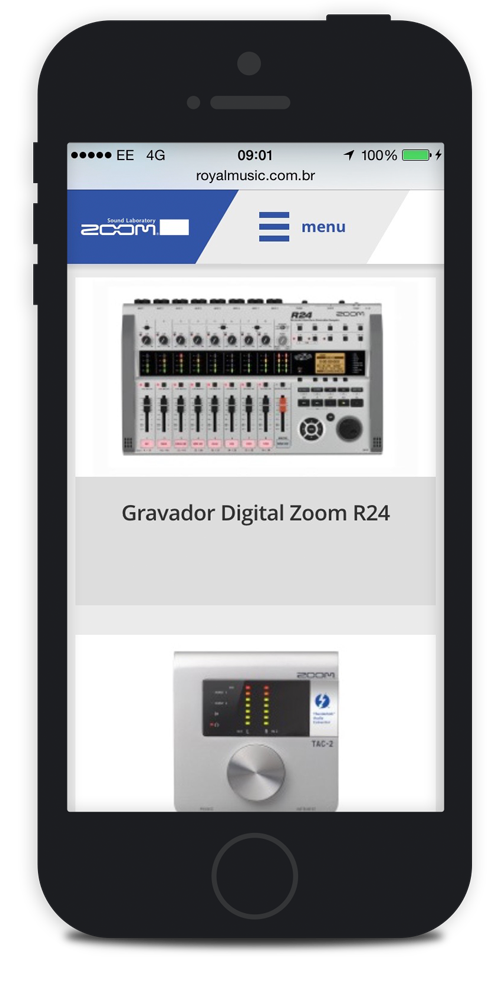
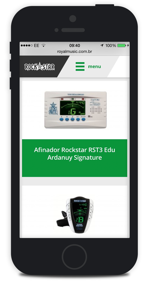
Brands Mobile Version
I worried available in all versions of the websites of the brands in the mobile version for the user to browse the catalog of products where and any place he had. Here follows some screens:
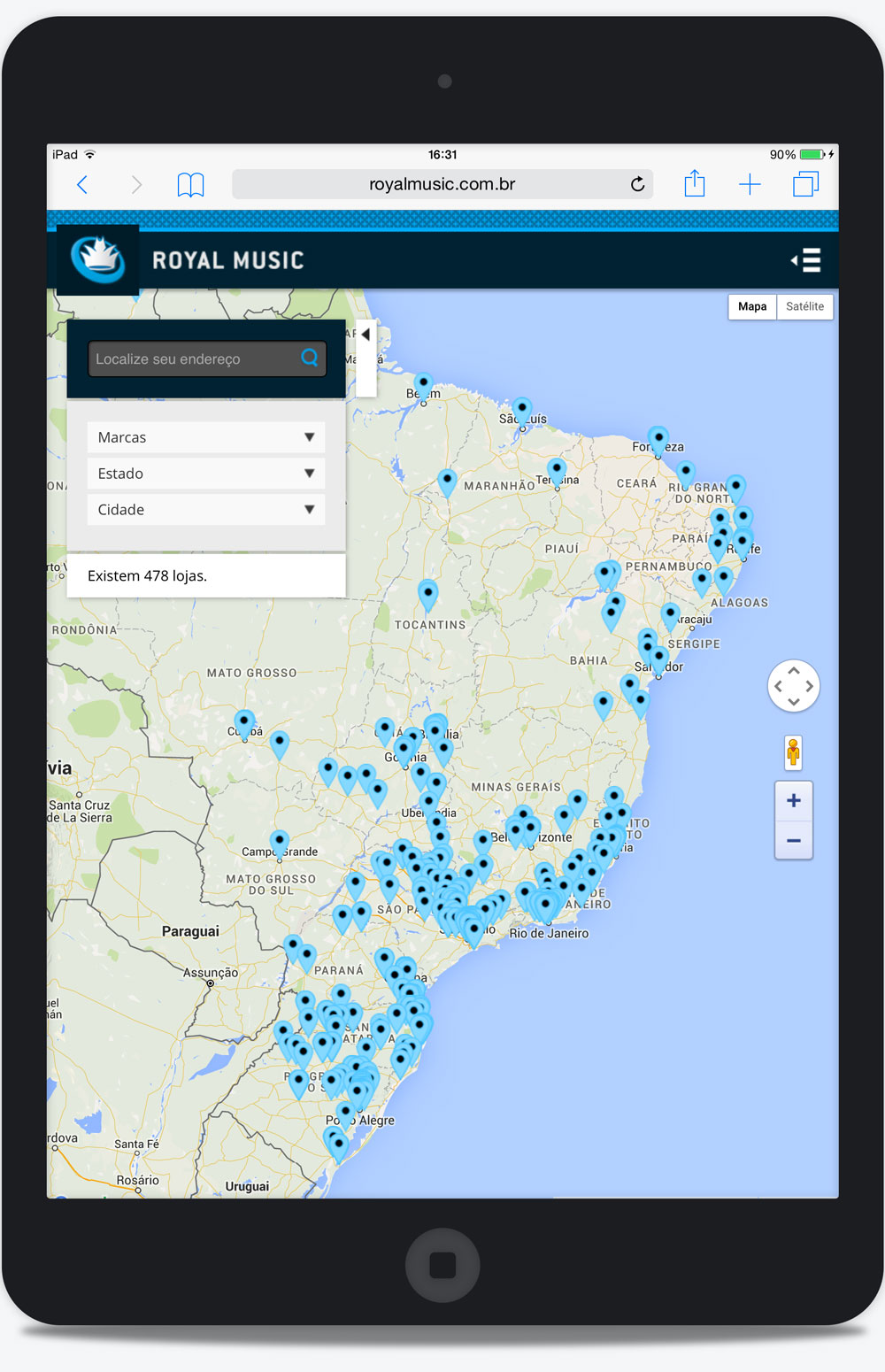
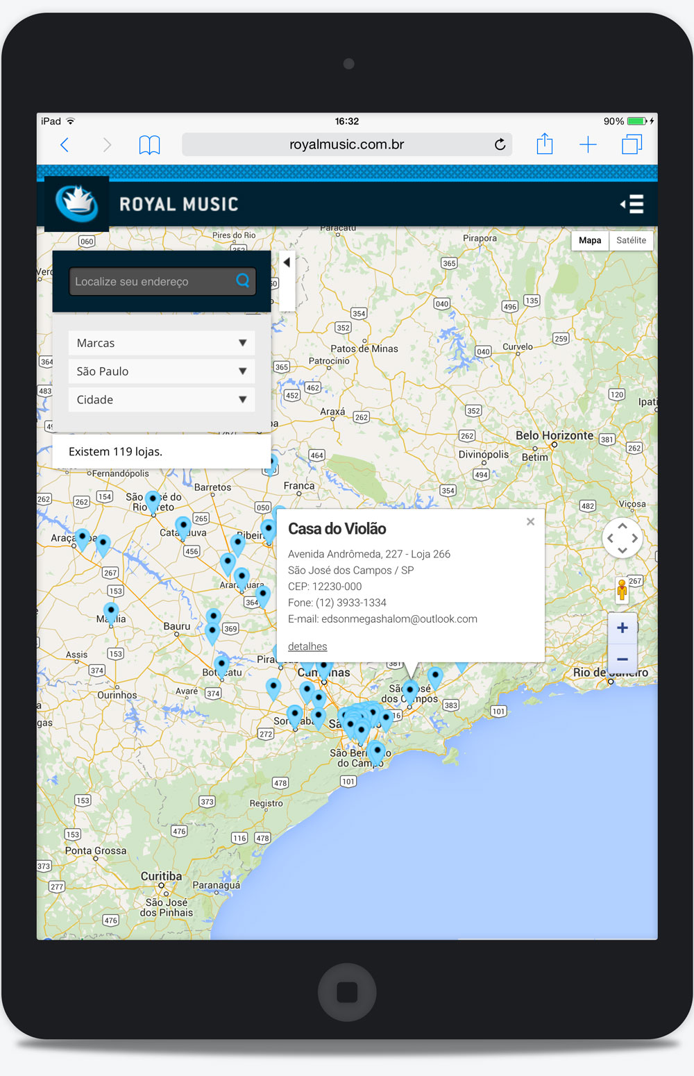
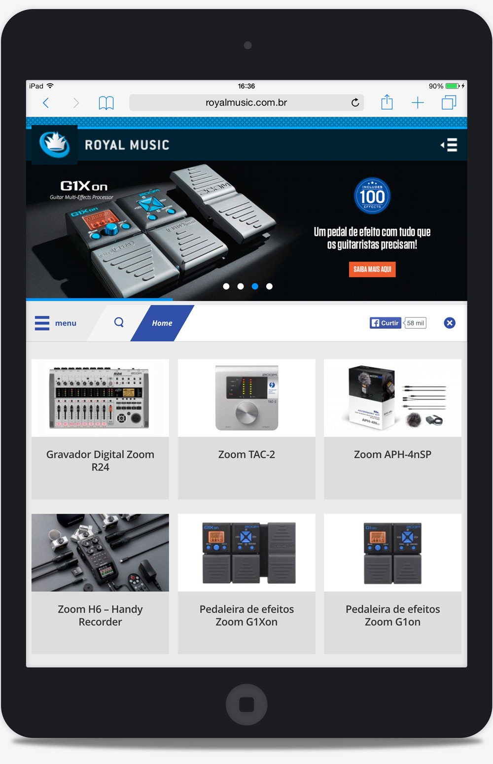
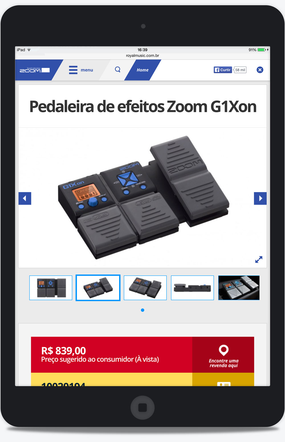
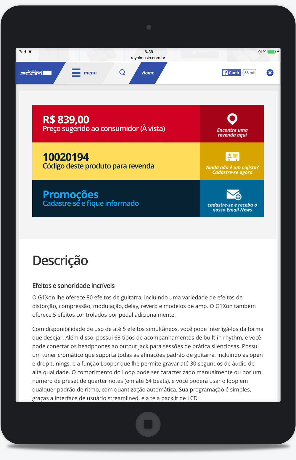
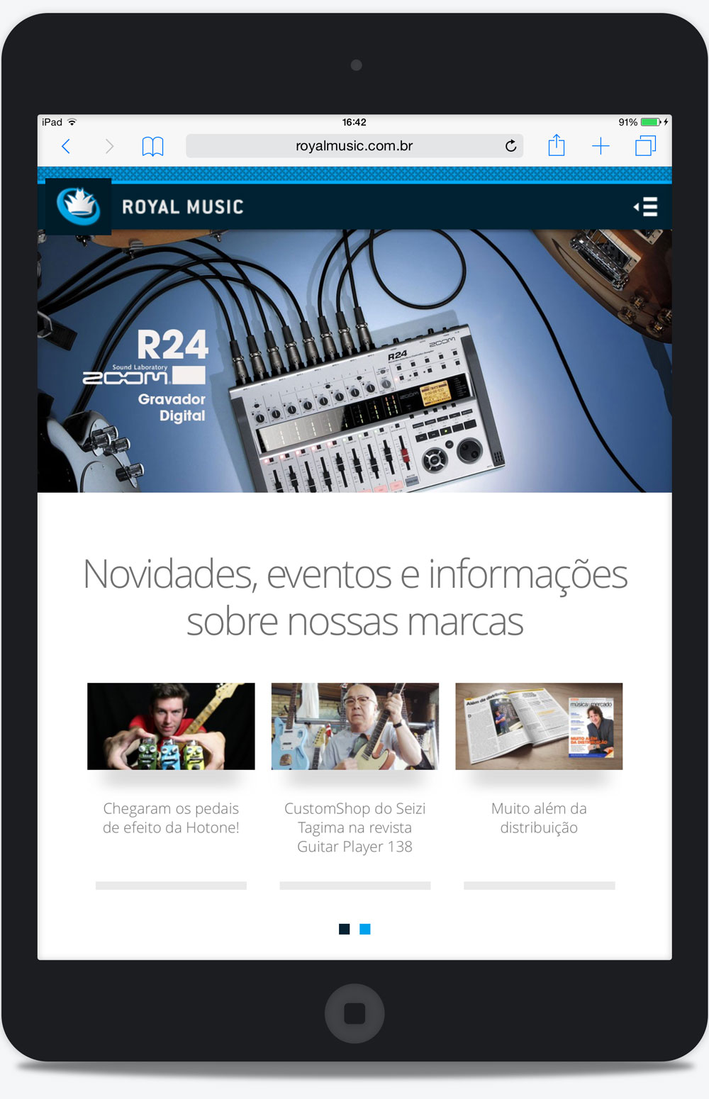
Tablet Version
All versions of the websites of the brands in the tablet version were required for a complete navigation in the product catalog. Here is some screens: